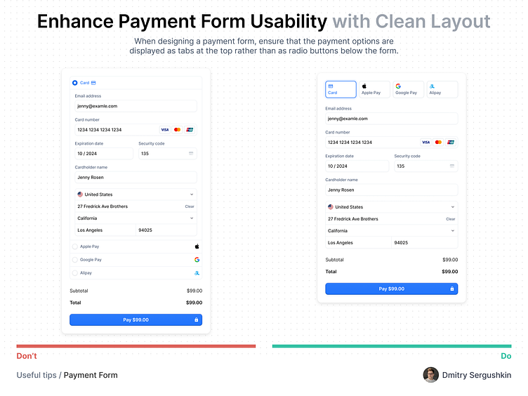
Payment Form
Hi Guys! ✌️
A/B testing has shown that displaying payment options as tabs at the top of the form significantly improves user experience compared to radio buttons below the form. With tabs at the top, users can quickly see and select alternative payment methods, resulting in a more intuitive and streamlined process. This layout prioritizes clarity, helping users complete their transactions with ease and confidence.
Are you looking for a design partner?
📮 Email to ux.sergushkin@gmail.com
👨💻 Check me out at dmitrysergushkin.com
↳About me
My name is Dmitry, and I am a digital product designer. I specialise in investigating and improving user experiences for CRM systems, SaaS platforms, Back offices, and web applications. I develop innovative solutions by identifying the problem that needs addressing and creating a meaningful experience that meets the needs of end-users, aligning it with the context in which the product will be used.
↳Services I provide
User Experience (UX) Design • User Interface (UI) • DesignWeb & SaaS Application Design • MVP Design & Development • Product Redesign & Optimization • Wireframing & Prototyping • UX Strategy & Discovery • Design Systems & Documentation
Have a complex web application idea?
Let's make it together!
Say hello at 💌
ux.sergushkin@gmail.com
Visit my Website 🌎
dmitrysergushkin.com
For more inspiration, visit my profiles ✨
