Filmic Pro
A study project on the logo redesign for a mobile video recording application that provides complete control over the filming process settings. The app has received high praise from the press, has been featured by Apple, and has been used for shooting feature films.
The new logo takes the main idea from the old one — using negative space and combining the outline of the first letter of the naming with the recognizable shape of film perforation, while slightly simplifying the construction and adding lightness and airiness to it. The muted red hue becomes fresher and more attention-grabbing.
All the dimensions of the signmark are tied to the golden ratio, which has made the internal elements more consistent in proportions and mass, while maintaining the metaphor of film perforation and making the letter “F” even more readable due to a slightly more recognizable shape.
The TT Norms typeface, due to its openness, helps the logo to be better distinguished at any scale, while the plasticity of the individual letter parts rhymes with the shape of the sign elements, further connecting it with the wordmark.
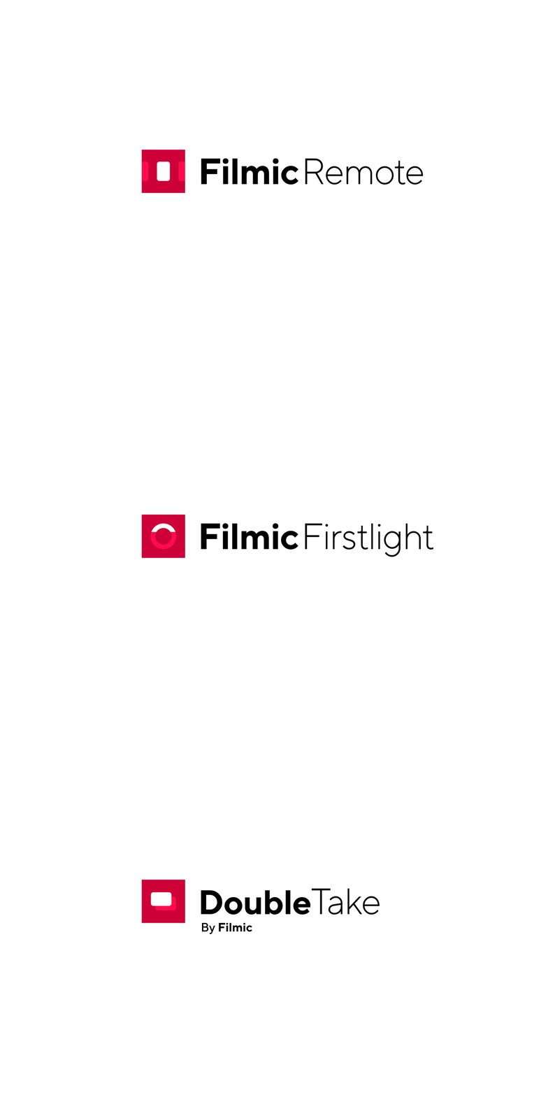
The new color palette and the shape of the perforation holes become key elements upon which other logos of internal services are built. Some of them use the shape of the perforation directly, while others retain the old, established symbols, updated only in terms of color shades.


