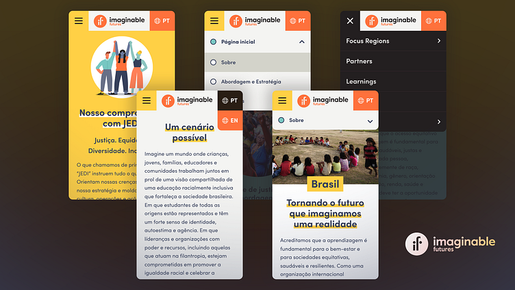
Mobile Exploration
A refresh for better readability.
With this project, I was tasked with redesigning a couple existing pages, designing a Brazilian Portuguese microsite, and expanding their branding to be more WCAG compliant through an extended palette of contrasting colors, user-friendly component size adjustments, and legibility-focused tweaks to the typography. These mock-ups apply these improvements to previews of the mobile microsite.
More by mandynicole View profile
Like


