Charlie HR: Improving Time-Off Management, Reducing Complexity
Context
Charlie HR is an HR software platform designed for small and medium-sized businesses, providing tools to manage team operations, including time-off tracking, employee onboarding, and performance reviews. I was a Product Designer at Charlie HR, where I led the design efforts to enhance the time-off allowance feature. I worked as part of a cross-functional team that included 1 Product Manager, 2 Product Designer, and 3 Developers. I was in charge of the UX design for the time-off allowance project.
Problem
Approach
We gathered all relevant feedback from support queries and conducted user tests to validate potential design improvements. The key challenge was addressing the complex permissions system that varied for team members, managers, and admins. I worked on sketches and flows, prioritising layout improvements, visual hierarchy, and clearer labelling to communicate allowances effectively.
Wireframes
Prototype
Challenges
I initially proposed a calendar view to better visualise allowances, but due to tight timelines, we had to prioritise a simpler, more immediate solution. This required balancing user needs with the constraints of time and development resources.
Solution
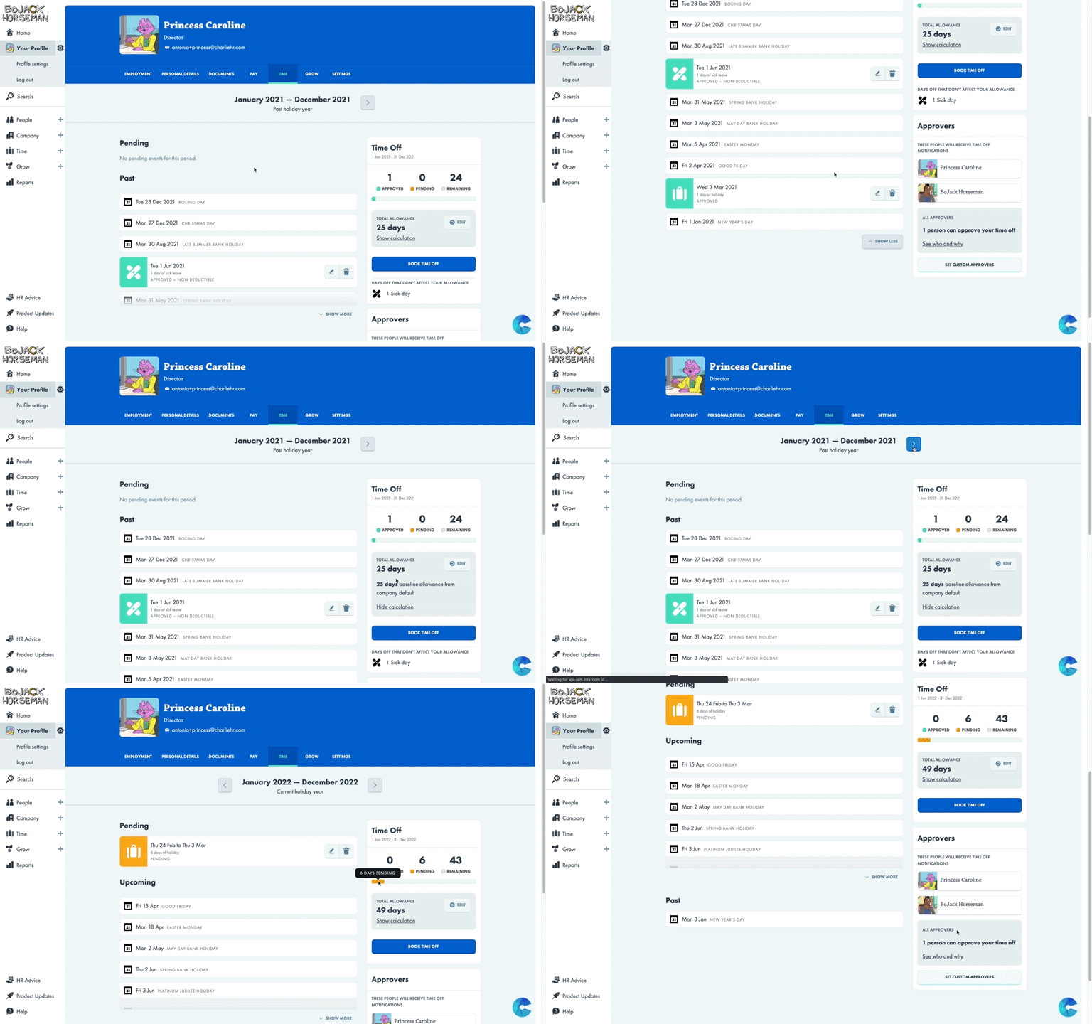
The final design focused on improving clarity by refining the layout and labels. Despite not implementing the calendar view, the redesign succeeded in making time-off allowances much easier to understand.
Outcome
Learnings
This project highlighted the importance of balancing big ideas with what’s realistic. By focusing on the main user needs and iterating based on feedback, we were able to deliver a solution that cleared up user confusion and met tight deadlines.


