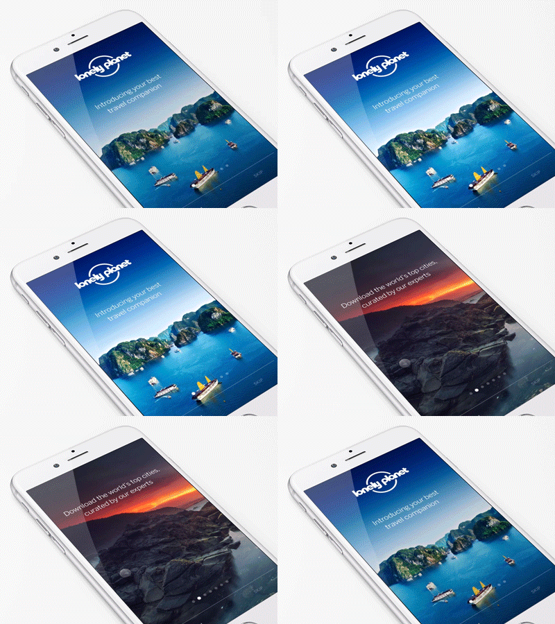
Guides by Lonely Planet - Onboarding
Hey friends,
Another shot from Guides by @Lonely Planet ’s App. Prototyping was pretty important while designing the app. We used @Framer to test animations and illustrate interactions and transitions. In this example we used a horizontal page component for the text while we are changing the state of the images underneath on each page. Changes on their 'state' included opacity and a subtle 'ken burns effect' zoom.
Check the video attached to see the full carrousel
As always a big shout out to @Brad Haynes , @Diego Jiménez and team for their awesome work.
You can download the app here:
https://itunes.apple.com/US/app/id1045791869?mt=8
https://play.google.com/store/apps/details?id=com.lonelyplanet.guides&referrer=af_tranid%3D3V541WRH2WDCBSZD%26c%3Dguides%26pid%3DLPLandingPage
Thanks!
