SAIKO | LOGO DESIGN & BRAND IDENTITY
Saiko sushi restaurant was born with the mission of helping customers fully enjoy the taste of Japan through each slice of fresh, quality sushi. Each piece of sushi at Saiko is a commitment to the sophistication and quintessence of cuisine.
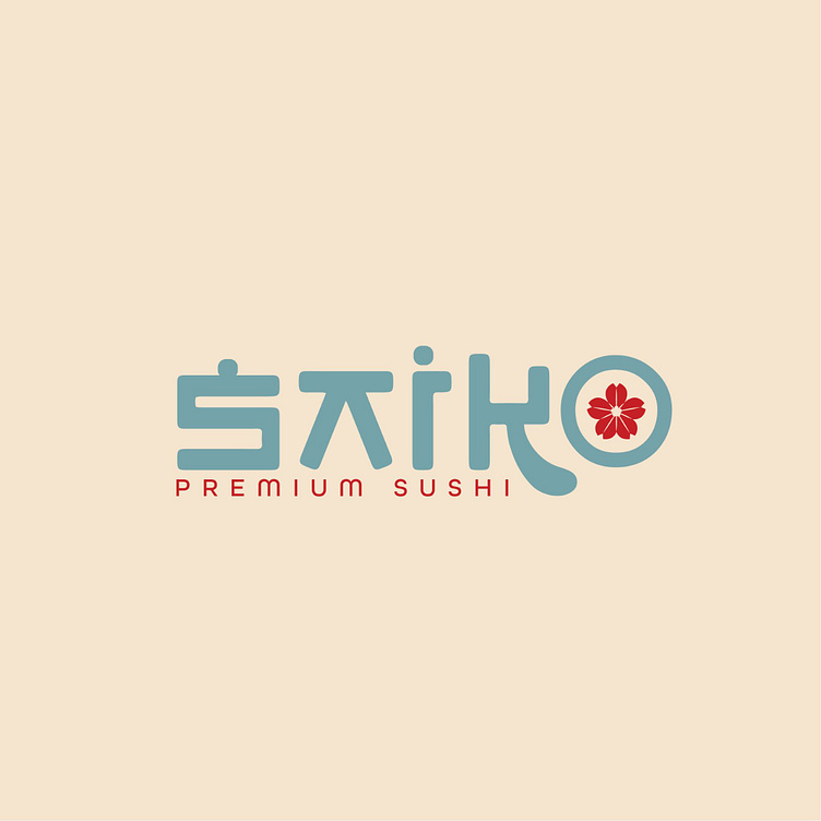
The Saiko sushi brand identity designed by Bee Art uses 2 main colors: blue and red. Blue represents freshness, gentleness and friendliness, very suitable for sushi restaurants, where the freshness of ingredients is the core factor. Meanwhile, red, in addition to expressing the passion and enthusiasm of the brand owner, is also a prominent color, easily attracting attention and leaving a deep impression on the viewer.
The Saiko sushi restaurant logo is designed using a modern, creative font with the highlight being a red flower inside the letter O. This combination not only makes the logo beautiful but also clearly conveys the core values of the brand: creativity, high quality and sophistication in every detail. This design helps the brand easily recognize and leave an impression on customers.
-
Client Saiko
Logo Design Project. Logo is designed for Japanese Restaurant.
Copyright© Bee Art. All Right Reserved
Contact us:
• Hotline/ Zalo: (+84) 77 34567 18
• Email: info@beeart.vn
• Website: www.beeart.vn
• Facebook: https://www.facebook.com/BeeArt.vn


