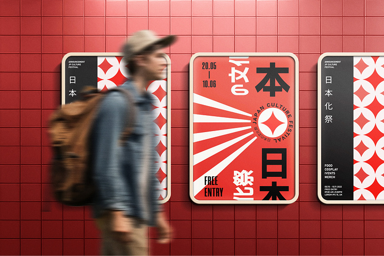
Identity for Japanese culture festival
JP culture fest
Sample Project - 2024
The logo is based on a fragment of a traditional Japanese pattern - sippo, which is depicted as circles overlapping four adjacent ones. The central parts look like stars, and when they overlap, they resemble flower petals. The sippo pattern was used to wish for prosperity and luck, so its meaning is perfect for the festival. This pattern is also used as a pattern in the project.
When designing the identity for a Japanese cultural festival, the colors red, white, and black hold profound symbolic meaning. These colors have been deeply ingrained in Japanese culture for centuries, representing various aspects of life, history, and tradition. (This concept, created for a sample brand but I am ready to customize for a real-world application)
I am open for new projects, ready to bring your vision to life! Feel free to contact me 👋
Behance / Upwork / Instagram
Email: annaberlinbluv@gmail.com / Whatsapp/Telegram number: +380683335623 / UA EN
Thanks for watching !
This concept, created for a sample brand but I am ready to customize for a real-world application.
I am open for new projects, ready to bring your vision to life! Feel free to contact me 👋
Behance / Upwork / Instagram
Email: annaberlinbluv@gmail.com / Whatsapp/Telegram number: +380683335623 / UA EN


