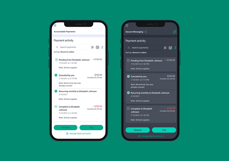
Dark Mode
I was asked to implement dark mode into our web app. Since the color had to translate well on both large and small screens, I chose lighter gray instead of black to prevent it from being too high-contrast on larger screens. The end result was an easy transition from light-to-dark, with very subtle changes between the brand colors.
More by Laura Pribyl View profile
Like
