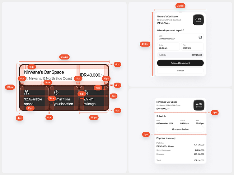
Component Spacing
Why Is Spacing Essential When Designing UI Components?
Creating Visual Consistency
With clear spacing rules, the UI design stays consistent throughout the application. This helps users recognize patterns and reduces confusion when interacting with different components.
Enhancing Hierarchical Understanding
Proper spacing highlights information hierarchy. For example, larger spacing between main components (like headings) and descriptive text or buttons indicates priority, allowing users to focus more easily on the essential elements first.
Streamlining Development and Maintenance
A structured spacing system allows design and development teams to work more efficiently, especially when updating or refining the interface. Designers and developers can follow established spacing guidelines without adjusting distances manually, saving time and reducing the risk of inconsistency.
Thanks for scrolling till the end🔥
Excited for new opportunity!
Let's have a chat!
↪︎ Email at emirabiyyu.hire@gmail.com
Reach me out at


