E-Learning Student Dashboard Design
Hi everyone! 🎉 I have recently completed a design concept for an e-learning student dashboard. This project focuses on creating an engaging and informative interface for high school and college students. It will help students track their course progress and manage assignments effectively. Here's a breakdown of the two main screens:
Dashboard Home Page
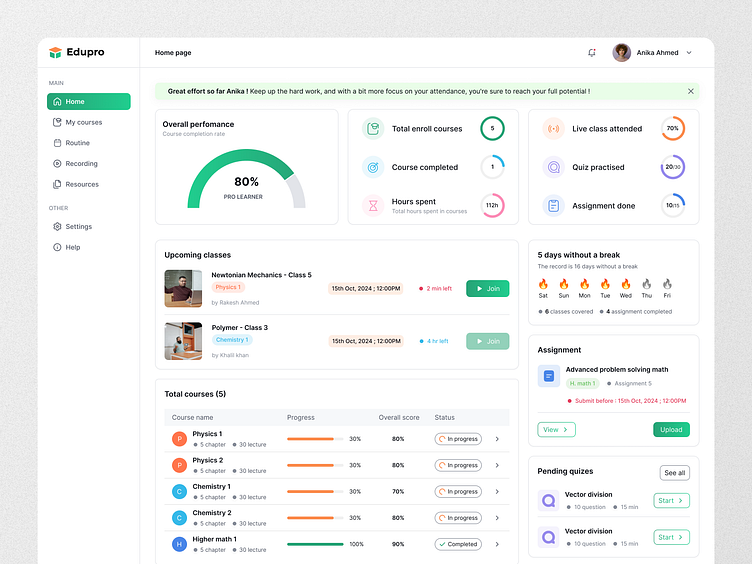
This screen provides an overview of the student's progress, upcoming classes, and other essential metrics to keep informed and motivated.
Top Section: An encouraging message at the top with performance insights to boost motivation.
Overall Performance: Displays a completion rate, giving a quick look at learning progress.
Quick Stats: Key metrics like total enrolled courses, completed courses, hours spent, and achievements (🟢 Live classes, 🟣 Quiz practice, 🟡 Assignments completed).
Upcoming Classes: A section showing upcoming classes with countdowns, making it easy to join sessions on time.
Streak Widget: Tracks learning days, motivating students to maintain learning consistency.
Assignments and Quizzes: Pending assignments and quizzes are shown with deadlines, ensuring stay on top of their tasks.
Area of Improvement: Highlights areas where a student can focus, like quizzes and assignments with lower scores, guiding her to improve specific skills.
Total Learning Time: A graph representing daily study hours over the last 15 days, helping students visualize their study patterns.
Course Progress Detail Page
This page dives deeper into progress in a specific course, providing insights into each chapter.
Overall Progress and Efficiency: Visual indicators for overall progress, efficiency rating, live class attendance, and other performance metrics.
Chapter Breakdown: Each chapter is broken down with topics, progress bars, overall scores, and completion status, allowing a student to manage learning step-by-step.
Tabs for Course Resources: Tabs for chapters, recordings, assignments, quizzes, and resources are available for easy navigation within the course content.
Notice Board and Area of Improvement: Updates and specific areas for improvement are shown on the right, ensuring a student receives relevant notifications.
Leaderboard: A leaderboard encourages friendly competition by showing position among peers.
✨ What do you think of the new design? Please drop your thoughts below! 💬👇


