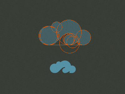
Personal Logo Mark
Who thought a bunch of circles would end up being so infuriating? Mostly because designing for myself, on something so personal is the worst thing in the world!
In my off time I have been slowly reworking my personal ID, getting my website prepped etc and wanted to create a new personal logo.
I wanted something that was kind of retro, incorporated an 'M' letter if possible, maybe had a touch of a surf/water aesthetic (having almost always lived near the sea) and was a cloud shape. (based on my last name Mcleod which is an old-school spelling of 'Mcloud').
So this is 'My Cloud' or Mycleod (see what I did there?) which is two parts 70's style lettering (see the Candice font) and one part iCloud.
More by David McLeod View profile
Like
