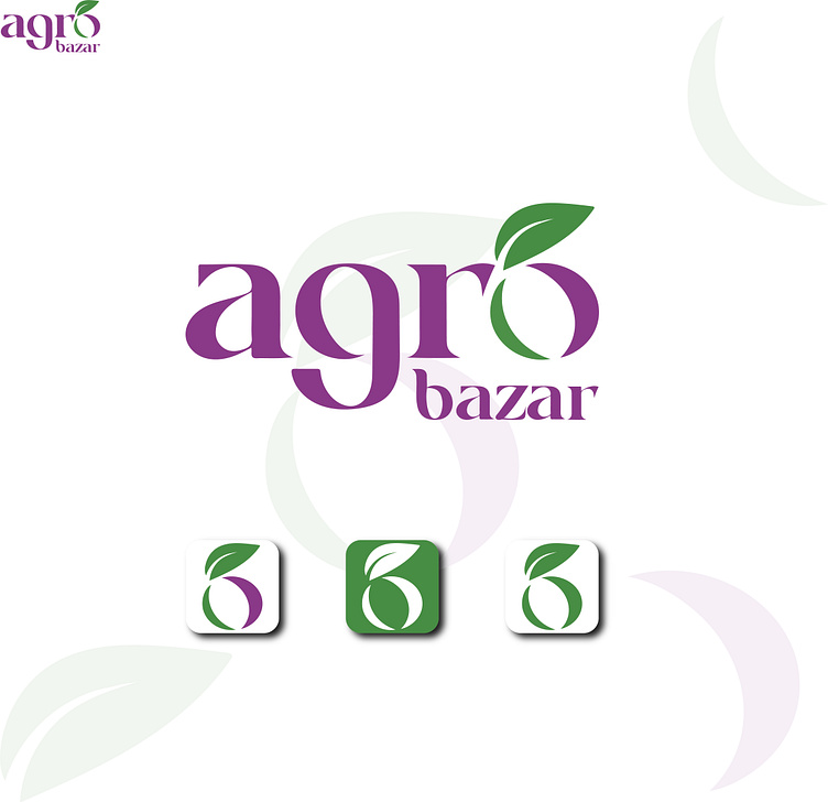
'Agro Bazar' Organic Logo Design.
Agro Bazar:
Logo Symbol Details:
The design creatively combines the elements of a leaf, seed, and the letter O.
Leaf: Represents the essence of growth, symbolizing nature and sustainability.
Seed: Represents the beginning of life and the organic roots of the business.
Letter O: Suggests "organic," conveying the brand's commitment to natural and organic products.
Typography:
The word "Agro" is in a distinctive font where the letter 'O' is designed to look like a leaf growing from a seed, reinforcing the organic theme.
The 'bazar' part is kept in a smaller, clean font, complementing the brand name without overwhelming the design.
Color Scheme:
The logo uses a green and purple color palette. The green symbolizes freshness, nature, and organic values, while the purple adds a unique touch, making the brand visually distinct in the market.
Icon Adaptability:
The logo is adaptable and can be used in various formats (e.g., as an icon for app or website use) while maintaining brand recognition.
Multiple color variations with green and white backgrounds offer flexibility for different branding materials.
Logo Design | Branding | Logo | Logo Branding | Banner Design
This Logo is Available for Sale!
If you're interested in purchasing this logo!
or want to discuss custom design services, feel free to contact me:
📧 Email: saifgiasalinasir@gmail.com
📱 WhatsApp: [Click here to chat](https://wa.me/97433754845)
Thank you for your interest!


