Food Delivery App
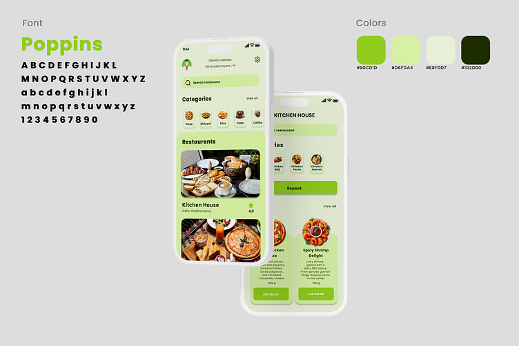
This UI design showcases a food delivery app with a modern, clean, and vibrant style. Key design elements include:
Font: The typeface used is "Poppins," which offers a rounded, modern, and approachable look, enhancing readability and contributing to a friendly, inviting interface.
Color Scheme: The primary colors used are shades of green:
#90CD1D: A bright, eye-catching lime green used for primary buttons and highlights.
#D6F0A4: A soft, pastel green used as a background to keep the interface light and fresh.
#E8F0D7: An even lighter shade, creating a gentle contrast for text areas.
#1D2D00: A deep, dark green used for text, providing clear readability.
Layout and Structure:
The top section features a search bar and profile icon, making it easy to navigate or search for specific items.
Categories are displayed in a horizontal scroll format with circular icons for different food types (like pizza, fries, cake, etc.).
The "Restaurants" section includes larger images with location details and ratings, allowing users to quickly identify and choose restaurants.
There’s a repeat button, suggesting easy reordering of previous items, enhancing user convenience.
The menu section features large, visually rich images of dishes with clear pricing and descriptions, making it easy for users to explore food options.
This design balances functionality with aesthetics, ensuring a visually engaging, user-friendly experience.
This UI design is a food delivery app interface that uses a soft, pastel purple theme, creating a friendly and elegant aesthetic. Key design elements include:
Font: The design uses the "Poppins" font, a clean, rounded typeface that provides a modern and approachable feel. The font choice supports easy readability across headings, buttons, and labels.
Color Scheme: This version is dominated by purples and light pinks:
#AC68B5: A medium purple used for primary buttons, headings, and some icons, bringing vibrancy to the interface.
#FAD9FE: A light pink that serves as the main background color, providing a soft and visually appealing backdrop.
#F5EBF6: An even lighter pink that subtly separates sections without overwhelming the design.
#1C0C1E: A deep, dark purple used for text, ensuring strong contrast for readability.
Layout and Structure:
The top section includes a search bar and user profile icon, providing easy access to personalization and search functions.
Categories are represented by rounded icons for various food types (such as pizza, fries, and coffee), arranged in a horizontal scroll format.
The "Restaurants" section includes large images with restaurant names, locations, and ratings, making it easy for users to browse popular options.
A "Repeat" button allows users to reorder past items, enhancing convenience.
The menu items are displayed with large, colorful images, prices, and descriptions, making it simple for users to explore and select dishes.
This UI design combines functionality with an inviting color palette, offering a user-friendly and visually appealing experience tailored for mobile food delivery.
This is a sleek and modern UI design for a food delivery app. It combines a vibrant color palette with well-organized elements to create a visually appealing and user-friendly interface. Here are some key highlights:
Color Scheme:
The design utilizes light green and pastel purple backgrounds, which create a calming and appetizing look. The choice of colors for buttons and accents, such as green and purple, makes actions and important sections stand out.
Layout and Structure:
Each screen is cleanly structured with clear sections, like "Categories," "Restaurants," and "Popular" dishes, making navigation intuitive.
Large food images give a visually immersive experience, capturing the user’s attention and appealing to their appetite.
Typography:
The fonts are readable and modern, with a good hierarchy in text size and weight. This helps differentiate between primary actions (e.g., "Add to cart"), secondary information (e.g., "Ingredients"), and supportive details (e.g., nutritional values).
Icons and Buttons:
Icons are used to enhance the interface’s readability, with functions like search, user profile, and delivery address clearly represented.
Buttons are prominent with clear labeling, and the use of rounded edges adds a soft, inviting feel to the design.
Product and Nutritional Details:
The product page offers detailed information, including the dish name, price, calories, estimated preparation time, ingredients, and nutritional values. This level of detail helps users make informed choices.
Visual Hierarchy:
The primary call-to-action (e.g., "Add to cart") is highlighted, making it easy for users to complete their order. Categories and popular items are also prominently displayed, guiding the user's attention to important sections.


