#DAILYUI CHALLENGE - 003/100 (WEB LANDING PAGE)
#DailyUI Challenge:
DAY 003/100 Website Landing Page
– Introducing Roast Resume Services providing Page
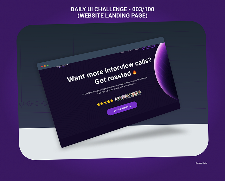
Today, I designed a landing page for Roast Resume Services Web Landing Page, an innovative service where users can get their resumes reviewed with constructive, yet witty feedback.
🔍 Design Highlights: Vibrant Hero Section: A striking banner with bold typography that reflects the platform’s unique blend of simplicity and expertise.
Clear Navigation: Straightforward paths for users to learn more or submit their resumes for feedback.
Engaging Content: Testimonials from users who’ve improved their resumes with Roast Resume’s services.
Visual Hierarchy: A clean layout that directs attention to key CTAs and service descriptions.
The goal was to craft a landing page that embodies the brand’s personality while ensuring a smooth, intuitive user experience.
Feedback is always welcome! What elements do you think make a landing page irresistible? 🤔

