TNT Sports Logo Redesign
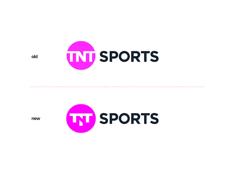
The TNT Sports logo redesign shows a subtle but impactful refinement. In the old version, the logo features the text "TNT" in white inside a solid magenta circle, with a horizontal break across the circle. The "SPORTS" text is in bold, uppercase, and black, aligned to the right of the circle.
In the new version, the "TNT" text inside the circle has been modified: the top bar in the "T" has been extended to create a more unified and stable appearance, and the circle remains the same vibrant magenta. This extension emphasizes a stronger visual connection, giving the letters a more cohesive and contemporary look. The "SPORTS" text remains unchanged, providing consistency and familiarity in the branding. This redesign enhances the brand’s modern and sporty feel while maintaining its recognizable elements.
Let me know your opinion on this shot!
Want to make a fantastic logo?
Feel free to reach out via DM or email:
👉 daudhasan313@gmail.com
👉You can get my service on 👉 Linkedin
Or 👉 Freelancer.com
📖Read my Client's Recommendations
👍 Follow me on Instagram
👍Check out my Behance profile
👍 Follow me on Twitter
👍 Follow me on Pinterest
