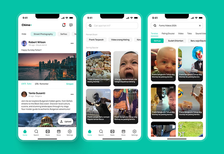
Social Media Mobile App - ChimeLink Interfaces
I worked on a simple case study for this design. It's just a practice project to sharpen my UI/UX skills as a junior designer, so apologies if it isn't perfect
Background & Goals
ChimeLink is a self-driven project designed to enhance my UI/UX skills by addressing limitations I’ve noticed in current social media platforms. Inspired by popular sites like Instagram and TikTok, ChimeLink focuses on improving user experience by tackling issues I’ve observed in these applications.
This project lets me dive into new ideas while keeping the user experience smooth and enjoyable.
I’m focusing on improving areas where today’s social media apps sometimes miss the mark, like adding more flexibility with music in photo stories and making content filtering feel more natural. The goal is to offer a cleaner interface with adaptive filters, so users can find what they’re looking for easily with the help of a smarter recommendation system. I’m also refreshing the visual design to give it a modern feel, all while sticking to navigation patterns that users already know and love.
Challenge?
I’m currently focused on some upgrades that aim to make the app more enjoyable for users without making things too complicated. For example, I’m adding a feature that lets people play music in their photo stories for up to 30 seconds.
It’s just enough to create a nice vibe without crowding the interface.
I'm also working on a filtering system that feels intuitive, making it easy for users to find what they're looking for while integrating nicely with search and recommendations. I want the design to feel fresh, but I’m mindful of keeping navigation simple and familiar, especially in important areas like DMs and notifications. My goal is to help users quickly find their messages and alerts without any hassle.
My Impact
With ChimeLink, I’ve had the chance to really boost my skills in creating user interfaces that mix modern design trends with practical, easy-to-use features. By looking for fresh ways to improve the social media experience, I introduced some unique ideas, like adaptive filters and the option to include longer music clips in stories. This project allowed me to create a design that’s not only visually appealing but also functional, showing my ability to blend creativity with user-centered and user-experienced solutions
Research (Goals)
📍 Understand user needs means Understand from current platforms the problems and goals they have for social media.
📍 Think Whether the Features are Worth: This will include how new features like long music on stories, AI adaptive filters etc. could be selected which will push out users against our framework.
📍 Layout Tips: Establish concepts that really must be combined into a user interface if it is to create sensation.
📍 Conduct Use Surveys: Use user surveys to learn how people feel about using social media apps today and what is the expectation for a new generation of social media platforms.
📍 Take a single competitor and analyse their features Instagram, tiktok 4. User friendly platforms Focus Groups: Hours spent talking with potential users, to solicit feedback on problems, needs and usability.
Problem Areas
📍 Limited Music Options: Many social media platforms only allow for short music clips in stories, which can limit how creative users can be in expressing themselves.
📍 Confusing Filtering Systems: Users frequently struggle to find relevant content because the filtering options are often poorly designed and hard to navigate.
📍 Stale User Interfaces: A number of social media apps continue to rely on outdated design elements
that don’t resonate with the preferences of today’s users, making the overall experience feel less engaging and enjoyable.
Lo-Fi Wireframes
With an app map ready, it was easier for me to make user flow and task flow. User Flow Checked in for the flightHas a terminal assigned to departure, layover, or landing. Since the feature is designed to be a mobile experience, push notifications also aid in that discovery process. (More Details will be Uploaded Soon, Below only the shorts one)
Conclusion
ChimeLink has audacious goals in changing the social media experience by eliminating the void they experienced with established platforms. ChimeLink specializes in the satisfaction of user needs, new features and ease of use to improve users pleasure, but a product that still promotes its creativity. The App has been constantly refined and these changes have only grown into the need to bounce back after being hit.
========================================================
Total 40+ Screen
🗣️ As a junior UI/UX designer, I’m really looking to gather any feedback or suggestions you might have. Since I’m still at the beginning of my career, I’m eager to learn and grow from constructive criticism. I want to refine my designs and make sure they truly resonate with users. Your insights would mean a lot to me and help guide my development. I really appreciate any tips or guidance you can share that will support my journey and help me become a better designer overall.


