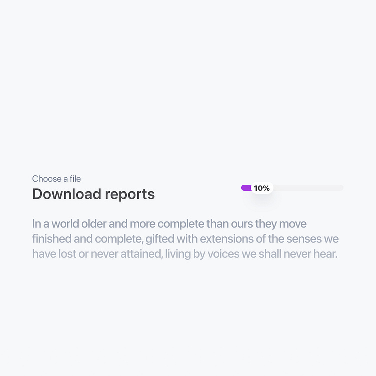
Progress indicators UI Component
Become a Professional UI Designer • Welcome to Gridstudio UI Kit
✦ You can Preview the kit here as well as purchase it from Gumroad here.
✦ This resource was made with Gridstudio UI Kit Pro version, Get pro version here.
✦ Free resources in Figma community here.
✦ Contact me on LinkedIn or send me a direct message via Instagram.
Overview Component
Bars or lines showing the progress of an ongoing action. Useful for processes like loading or uploading.
Premium UI Kit
Gridstudio Premium UI Kit is the most extensive and best-selling Figma UI kit and design system worldwide. Join over 1,000 designers, design any project, save countless hours, and elevate your skills as a designer.
✦ Constantly updated with Auto Layout, smart variants, properties, and nested instances.
✦ Preview Gridstudio Premium UI Kit in Figma.
✦ Colors are contrast-based and intuitive, ensuring a scalable and consistent system.
Improve Your Process
Tired of spending endless hours starting from scratch on every project and recreating the same components? Gridstudio Premium UI Kit comes packed with everything you need to design modern and stunning UIs and websites.
300+ Local Styles
◇ A smart, scalable typography system for any project.
◇ An extensive, practical, and accessible color system.
50,000+ Components and Variants
◇ Meticulously built with 100% Auto Layout 3.0 and intelligent variants.
◇ We’ve included everything you need so you don’t have to — the most comprehensive and refined UI kit for Figma available today.
Ready-to-Use in Any Project
◇ Focused on real-world usability with examples you’ll actually use in projects — landing pages, common pages, dashboards, and settings.
◇ Use the UI kit as a public library to work globally across all your projects. Any changes made in the main file will automatically be reflected wherever you use them.
Enhance Your Design Skills
Ready to streamline your design workflow? We’re here to help you finish projects up to 10x faster, take on more clients, and have more time for important tasks. Gridstudio Premium UI Kit has everything you need.
Each component is expertly crafted with 100% Auto Layout 4.0, smart variants, and a focus on accessibility. Swap out variants seamlessly and effortlessly. We’ve anticipated your needs so you can start designing immediately.
Why We Created Gridstudio Premium UI Kit
We created Gridstudio Premium UI Kit out of necessity. After trying multiple Figma UI kits, we kept encountering the same issues: they were often too small, inflexible, or poorly made — sometimes all three. This forced us to redo low-quality components from scratch.
We needed an “all-in-one starter” kit for new freelance projects and design systems without having to start from scratch every time. Rebuilding the same common components repeatedly became not only time-consuming but also one of the least exciting parts of the design process.
To address this, we developed Gridstudio Premium UI Kit. We ensured it includes everything necessary to create modern, beautiful UIs and websites, all within an organized and user-friendly package.
This kit was designed for unlimited use across projects. We made it as neutral, flexible, and scalable as possible, making it the perfect starting point for any design project.
Made in Colombia with ❤️
