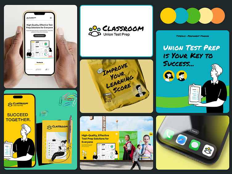
Logo Design, Rebranding, Brand Guideline for Education Platform
Brand Guideline & Creative Process for an Education Platform
Story & Values Start with the “why” — inspire curiosity, growth, and inclusivity in every element. The brand should feel like a friendly guide on a learning journey.
Custom Illustration Style Create warm, unique illustrations with soft colors and round shapes. Think about characters in action, exploring, learning, and growing. Use simple metaphors, like mountains or stars, to show learning milestones.
Color Palette & Typography Choose bright, welcoming colors like teal, coral, and mustard. Pair bold, readable fonts for headers with softer fonts for body text to keep it friendly and accessible.
Icons & Micro-Illustrations Use mini-icons for books, pens, stars, etc., to give the brand personality and make navigation fun and intuitive.
Real-World Application Mock up the design across social media, website, and mobile to see it in action. Visuals should tell the story of users learning, connecting, and growing with the platform.
Creative Process Research, sketch, and test. Refine based on feedback to make sure every piece fits the brand’s mission of empowering learning.
Make the guide easy to follow, so every touchpoint feels like part of the same story.
Hire
5123334515
snali4u@gmail.com
www.11thagency.com
