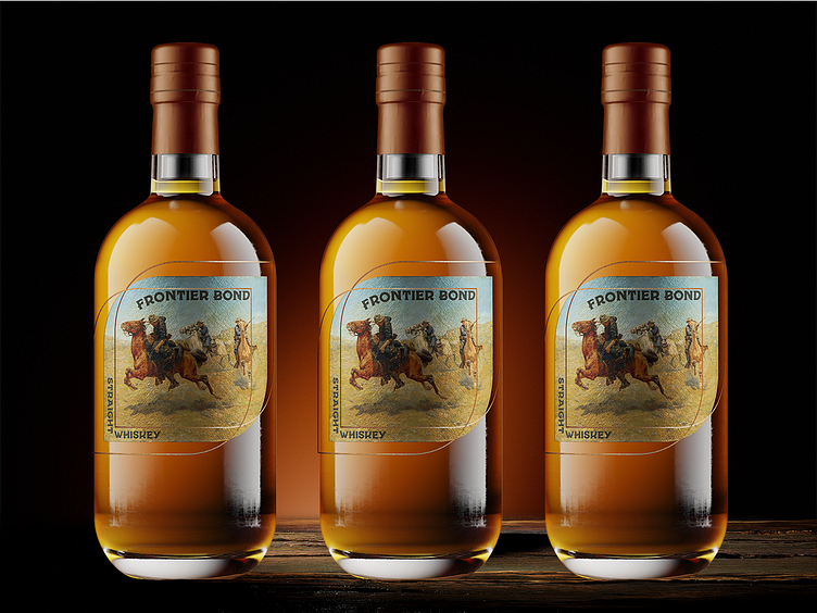
Frontier Bond - Whiskey Label Design
Spirits of Distinction
Spirits of Distinction is a design journey through the diverse and storied world of distilled spirits. The goal of the series is to capture the essence of each spirit—from classic gin and whiskey to exotic rums and eaux-de-vie—in a unique label design that reflects its origin, culture, and character. Each label will serve as a tribute to the craft of distillation, blending tradition with visual artistry to celebrate the spirit’s individuality and history. With Spirits of Distinction, every bottle tells a story, inviting you to explore the world one spirit at a time.
About Straight Whiskey
Straight whiskey is a bold and authentic spirit aged for a minimum of two years in charred new oak barrels, offering rich, unadulterated flavors that showcase the natural character of the grain and a smooth, robust finish.
About The Design
Enter your text here...
About The Design
The Frontier Bond whiskey label embodies the rugged, untamed spirit of the American West, capturing a sense of adventure and camaraderie on the frontier. The label's centerpiece is a vintage-inspired illustration of horseback riders galloping across an open landscape, evoking tales of resilience and brotherhood. With its muted, earthy color palette and aged paper effect, the design harkens back to historical posters and wanted signs, reinforcing the authenticity of this straight whiskey. The bold, arched lettering of "Frontier Bond" commands attention, while the curved frame around the illustration adds a sense of movement and freedom. Overall, this label speaks to a time of exploration and forging bonds in a wild landscape, making it a fitting homage to the bold, uncompromising character of straight whiskey.


