Set icons desing
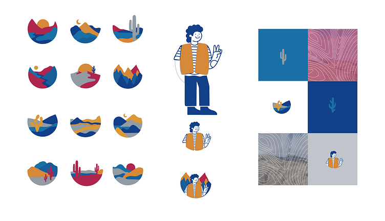
This visual layout shows a thoughtfully designed set of icons, characters, and textures that together create a distinctive brand aesthetic for CMP. https://www.cmp.cl/
Iconography: Each icon captures different elements of landscapes, mountains, sunsets, and desert plants, which evoke a sense of connection to natural and mining environments. The bold, simplified shapes and warm-toned colours (reds, oranges, and blues) add a friendly yet professional feel to the brand. These icons are well-suited for modular use in presentations or digital interfaces.
Character Design: The character has a friendly and approachable style, with a simple, clean linework and colour palette that matches the icons. The character’s casual pose, with a peace sign, gives a welcoming, relatable touch that aligns well with internal communications aimed at employees or training materials.
Textures and Backgrounds: The textures integrate contour lines that suggest geological topography, adding depth and linking back to the mining industry. The use of earthy tones alongside vibrant colours creates a balance between natural and industrial elements, enhancing CMP's connection to the environment it operates in.
This visual set provides CMP with a cohesive, engaging identity that is visually accessible, professional, and strongly tied to its mining industry context.

