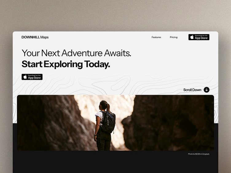
Hiking Maps App Landing Page Concept
A clean and modern approach to a hiking app landing page. Clear link to download in the app store and links to the most common interests for the users (features and pricing). The scroll down icon offers users an alternative direction to explore. The hero image gives the user a specific feeling you want to associate with the app. In this example, it's exploration.
More by Sam Xander View profile
Like


