Armazém das Artes
Re-branding_ Armazém das Artes
partnership with https://www.jonatasbarros.work/
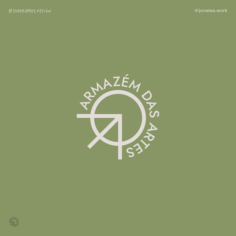
This commission represents the evolution of Armazém das Artes as part of the heritage of and for Alcobaça and the Western region. It maintains the AA's contemporary and progressive brand identity and makes the image a call to the more humanist and material side, reclaiming its roots.
With this new proposal, the AA brand hopes to gain new foundations that will make the Armazém space an iconic and cult site in the West region.
For this project we took the following points into account:
Visual balance of the symbol
Small optical adjustments were made to make the logo more proportional and pleasing to the eye.
Typographic change
This was also a crucial element in refining the AA brand. A more geometric typeface was chosen to create a certain connection with the symbol. Jost (the chosen typeface), inspired by the well-known Futura typeface, has striking characteristics such as low contrast, as we can see in the letter “o” with its almost perfect circles, triangles and squares, all of which are somewhat related to the symbol.
Horizontal variant
This last point is crucial in the sense that sometimes you need a brand variant so that you don't lose prominence in certain publications or applications. It is a variant that should only be used in specific cases mentioned later in this manual.
Translated with DeepL.com (free version)


