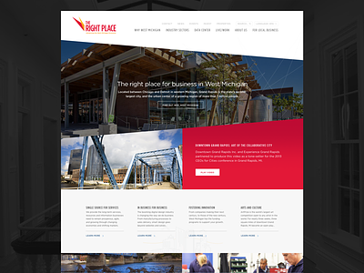
The Right Place homepage
The homepage for The Right Place. The existing print identity uses strong, contrasting colors and color photography from the city. We wanted to build off this bold expression while also providing familiar patterns for an audience accustomed to more traditional layouts. Check out the attachment for full size.
As a bonus, in the finished homepage, we had the chance to implement a lightweight video background. Take a look: http://www.rightplace.org
More by Mighty in the Midwest View profile
Like

