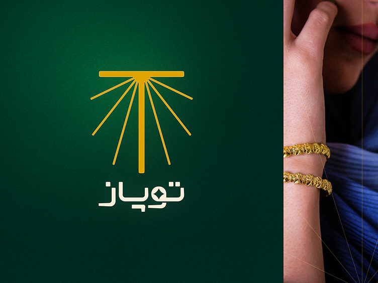
Topaz Gallery Logo & Logotype
Topaz Gallery Logo & Logotype
Hey everyone! Here’s my latest logo and logotype design for Topaz, an online gallery specializing in silver bracelets with gold powder coating. They’re exclusive focus on bracelets, catering solely to women and selling exclusively online.
Logo: At first, I considered using circular or oval shapes to mimic the form of a bracelet. But I decided to go with a fresh approach, using the initial “T” from Topaz. I added some angled lines to suggest a sparkle effect, extending these lines into an oval shape to enhance the design flow. To make the “T” more recognizable, I thickened its lines. The end result gives a subtle feel of a spotlight shining down, highlighting the essence of Topaz.
Logotype: I kept the Persian and English logotypes simple, as they’re always used alongside the logo. I added a small sparkle effect on the “O” in the English version and on the “و” in the Persian version to keep things visually interesting without overwhelming the design.
Color Palette: The primary color is dark green, chosen to evoke a sense of calm and trust, with gold and skin tones as secondary colors to complement the overall look.
Let me know what you think in the comments—always open to feedback!
Thanks for checking out my latest design! If you're interested in a custom piece, I'd love to hear from you. DM or email me. And of course, don't forget to follow me on Instagram & LinkedIn for more creative stuff.


