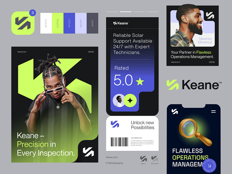
Keane™ - Logo & Branding for Project Management Inspection App.
Just wrapped up an incredible branding project for Keane™, a project management inspection app focused on precision and efficiency in every inspection.
The journey was both challenging and rewarding. We started with comprehensive research to understand Keane's mission and the unique strengths they bring to project management. From there, we brainstormed extensively, refining the designs through multiple iterations to capture the essence of their brand. Every element, from the logo to the complete brand identity, was thoughtfully crafted to mirror their dedication to accuracy and excellence in project inspection. 📋
Concept: Letter K + Check Mark
Color Psychology: Green and purple perfectly reflect Keane’s brand: green symbolizes growth, stability, and trust—essential for project management—while purple adds a sense of creativity and quality, enhancing trust in their expertise.
Press "L" to show your love ❤️️
____________________________________________________________________
👉 Let's work together and elevate your brand!
📩 Available for new projects :
Email: info@rahidrehman.me
WhatsApp: https://wa.me/+8801705553455
Telegram: @rahiddesigner
💡 Follow for more update: Dribbble, Behance, Instagram, Twitter, Linkedin
© Rahid Rehman
