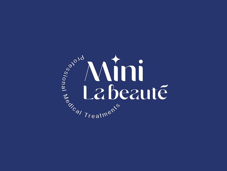
MINI LA BEAUTÉ | LOGO DESIGN & BRAND IDENTITY
With the goal of providing customers with optimal and safe care, Mini La Beauté affirms its position through high-quality products and services, combining advanced technology and modern beauty methods. Mini La Beauté aims to build trust with customers, helping them achieve natural and healthy beauty.
The Mini La Beauté brand identity designed by Bee Art uses a combination of two colors, blue and pastel purple, creating an elegant, gentle and sophisticated feeling. The harmonious transition between colors brings a sense of peace and relaxation, suitable for the space and experience that Mini La Beauté wants to bring to customers. Blue symbolizes trust and professionalism, while pastel purple brings a gentle and luxurious beauty, while stimulating a feeling of relaxation.
The logo is designed to stylize the brand name with a soft, graceful font style, combined with a delicate small star above. This star symbolizes the brand's special care and commitment to providing high-class service. With stylized letters and graceful round strokes, the logo not only reflects professionalism but also evokes a sense of closeness and friendliness, helping customers feel comfortable and secure when using the service.
--
Designed by Bee Art
-
Client Mini La Beauté
Logo and Branding Project. Logo is designed for Beauty Spa.
Copyright © Bee Art. All Right Reserved
Contact us:
• Hotline/ Zalo: (+84) 77 34567 18
• Email: info@beeart.vn
• Website: www.beeart.vn
• Facebook: https://www.facebook.com/BeeArt.vn


