Dialexy: Redesigning Translation Flow to Boost Completion
Context
Dialexy is an award-winning certified translation company offering an AI-supported platform for processing and translating official documents. In 2020, the platform faced high drop-off rates during its "translate your certificate" flow. By conducting UX research and implementing design improvements, I increased completion rates by 2.5x, making the platform more user-friendly and accessible.
Process
We started by conducting surveys and analysing user data to understand the reasons behind the drop-offs.
Initially, we assumed that the platform’s main users were young adults (ages 17-25) translating university documents. However, research revealed that the average user was 30, and many were over 50, translating documents for pension and compensation purposes.
This shifted our focus toward making the flow more accessible for older people.
UX personas
Design Approach
I worked on several wireframes and prototypes to test various solutions. We identified that the unclear language and steps within the flow were causing confusion, particularly during the payment stage. By reorganising the flow, clarifying language, and simplifying navigation, we were able to reduce cognitive load for users. Additionally, I referenced the GOV.UK accessibility guidelines to ensure that the design was inclusive and easy to use for all demographics.
User flow
Wireframes
Final solution
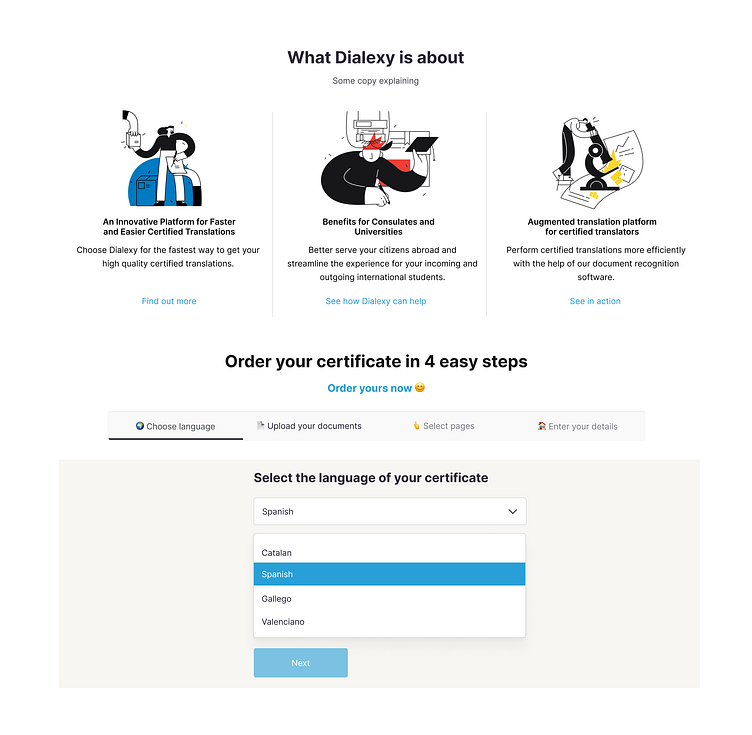
The final design focused on a clear, step-by-step process that was easy to understand and follow. We provided a simplified "vanilla template" that could be customised with the colors and branding of Dialexy’s institutional partners. The focus was on providing users with clear expectations throughout the flow, especially leading into the payment stage.
Outcome
The redesigned certificate translation flow resulted in a 2.5x increase in completion rates. Additionally, the improved design reduced the number of support inquiries, demonstrating that users found the new process easier to navigate and more intuitive. The accessibility improvements further ensured that the platform catered to a broader audience, leading to higher user satisfaction and engagement.
Learnings
This project emphasised the importance of validating user assumptions early in the design process. By tailoring the flow to meet the actual needs of an older user base, we improved both usability and accessibility. Additionally, the experience reinforced the need for clear communication and simple navigation, especially in complex processes like document translation.


