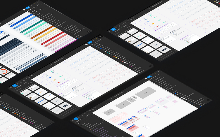
Charlie HR: Design System
Context and Problem
CharlieHR, an HR software platform, faced significant challenges with its design system. The existing system was outdated, with multiple libraries and inconsistent documentation. Designers had to navigate various component versions, leading to inefficiencies, while developers spent excessive time deciphering how components should behave. Additionally, accessibility across the platform was poor, with over 205 WCAG violations. The fragmented system also made UI/UX changes difficult and slow
Goals
Process
Audit and Feedback Collection
Conducted a comprehensive audit of current components and workflows.
Gathered feedback from the design and development teams to identify key pain points, focusing on time-consuming tasks and bottlenecks.r text here...
Color and Typography Simplification
Design Tokens: Introduced design tokens, reducing the color system by 80% and laying the groundwork for potential rebranding.
Typography Overhaul: Resolved hierarchy issues by standardizing font usage and simplifying the typography system by 150%
Collaboration
Team: Led by myself with contributions from the design team and two front-end developers.
Workshops and Documentation: Hosted workshops for designers to align on system changes, and provided thorough documentation for developers to ensure consistent adoption.
Challenges
Convincing stakeholders of the value in investing time and resources into non-user-facing improvements.
Maintaining consistent communication across teams and aligning design decisions with business goals. here...


