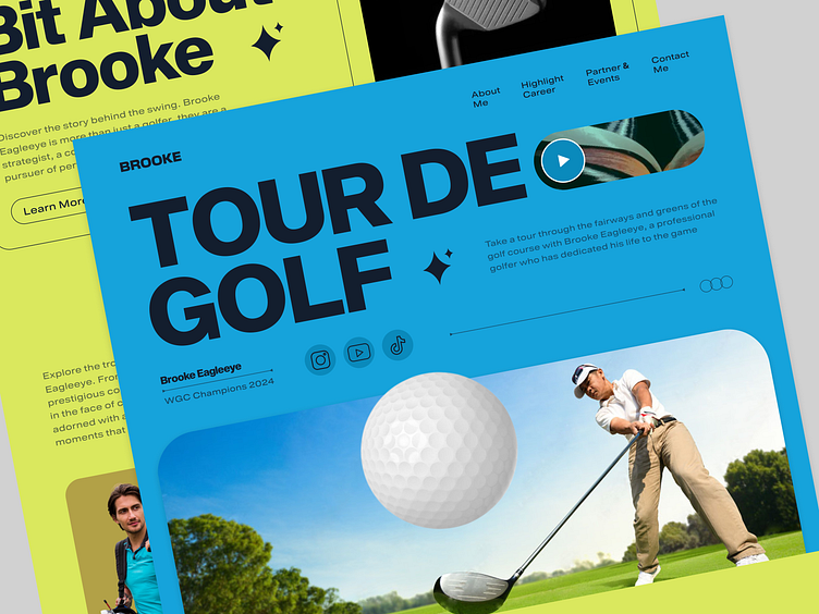
Brooke Eagleeye Personal Athlete Landing Page UI Design
As a rising star in the world of professional golf, Brooke Eagleeye needed a digital presence that reflected his achievements, personality, and passion for the sport. The primary goal was to create an immersive, visually appealing landing page that would appeal to fans, sponsors, and the broader golf community while maintaining a professional aesthetic.
We opted for a clean, modern design with a green and white color scheme inspired by the golf course. Green tones signify the sport, while white provides a fresh, clean contrast. Subtle textures and patterns reminiscent of golf course elements, like grass and sand, added visual interest without distracting from the content.
Brooke Eagleeye personal brand with a professional look was key. We wanted the site to appeal broadly to fans without losing the appeal for sponsors. It was also a challenge to keep the design focused while providing comprehensive information about his career, interests, and future plans.
Full Page Preview
Let's chat 👋
or
nirobman100@gmail.com / facebook / WhatsApp: 01758235283
We are open for partnership to build your next awesome product


