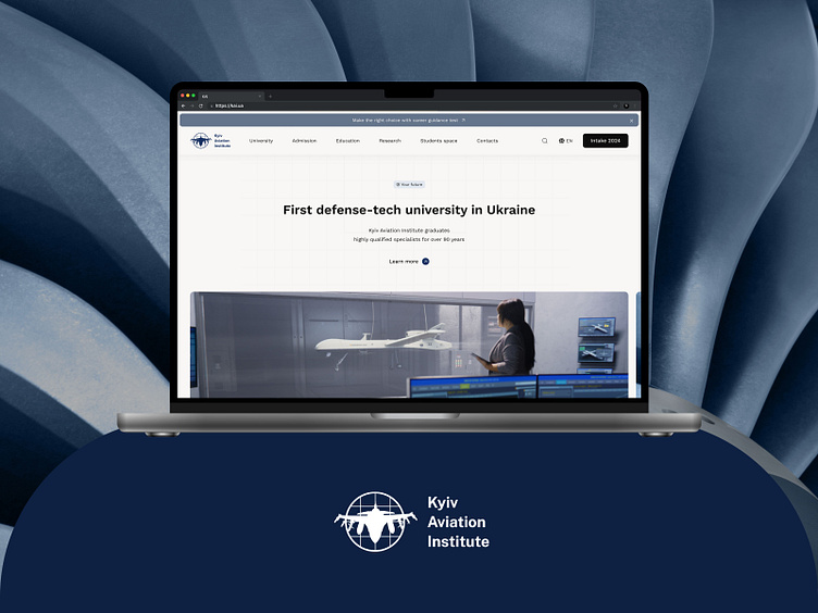
KAI Defense-Tech Website Redesign
Project Overview
As a finalist 🎉 in DEV Challenge XXI – Europe’s largest championship for IT professionals, I undertook the task of renovating the Kyiv Aviation Institute (KAI) website. The objective was to create a design that reflects KAI’s transformation into Ukraine's first defense-tech university, emphasizing its role in training personnel for the defense sector and conducting innovative research. The challenge required a user-friendly, visually striking site that positions KAI as a progressive, technological institution. The redesign focuses on usability, emotional engagement, and showcasing KAI’s commitment to developing modern, essential careers in defense and technology.
◖Logo Design & Identity
The new logo embodies KAI’s progressive, defense-focused mission. A circular form represents global reach and continuity, while the grid nods to technical precision. A fighter jet breaks through the circle, symbolizing innovation and forward momentum. The adaptable design works seamlessly across digital and physical media, reinforcing KAI’s identity at every touchpoint.
▮ Logo Design & Identity
The new logo embodies KAI’s progressive, defense-focused mission. A circular form represents global reach and continuity, while the grid nods to technical precision. A fighter jet breaks through the circle, symbolizing innovation and forward momentum. The adaptable design works seamlessly across digital and physical media, reinforcing KAI’s identity at every touchpoint.
◖Colors & Typography
A blue-dominated palette signifies the aviation focus, paired with a subtle beige background and clean graphite text. This modern, professional color scheme aligns with KAI’s mission in defense and technology. I chose Work Sans for its readability and contemporary feel, achieving a balance between professionalism and approachability.
◖New Website Design
The redesigned site emphasizes KAI's evolution as a defense-tech leader. Clear categories and an intuitive layout guide users effortlessly, solving previous navigation issues and providing easy access to essential information. From prospective students to partners, each user now experiences a seamless journey through KAI's technological and educational offerings.
Results
The revitalized KAI website now reflects the university’s commitment to defense technology, user-focused navigation, and continuous innovation. With its improved structure, up-to-date content, and focus on defense-tech advancements, the site positions KAI at the forefront of engineering and technology education in Ukraine.
🤝 Let’s make ideas happen:


