👻 Boo Bites Halloween Candy Store 🎃
Meet Booboo!
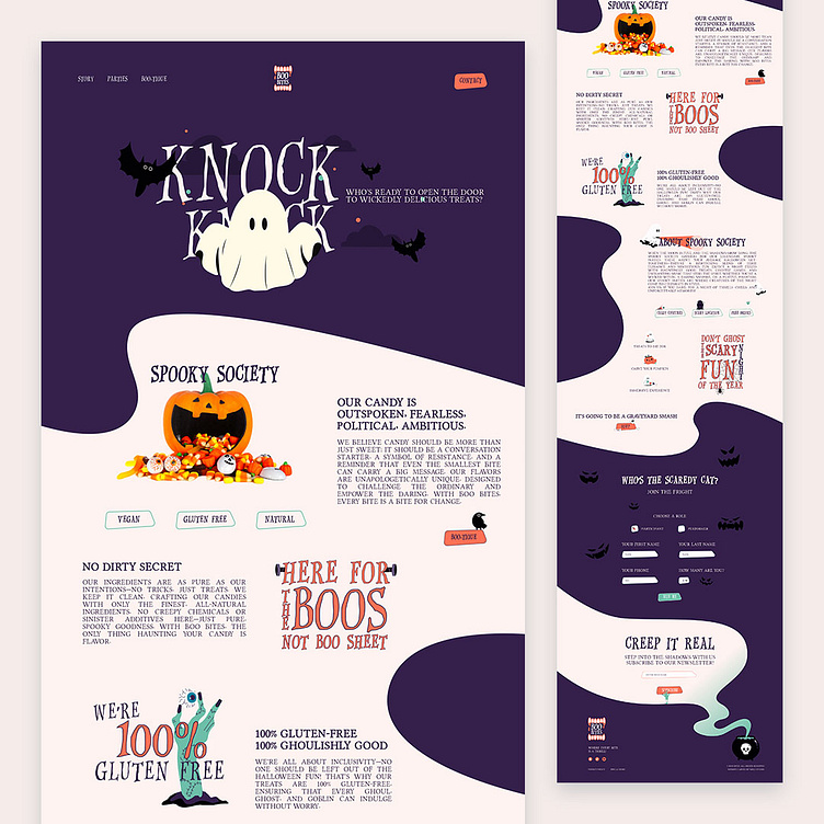
This Halloween, I’m super dope to share the design case study for Boo Bites, a candy brand that's bringing spooky sweetness to the web! The homepage design is a perfect blend of modern, fun, and visually captivating elements, featuring Booboo, a quirky little ghost who’s here to guide visitors through his eerie yet delightful candy shop.
The dark, moody palette sets the perfect spooky vibe, balanced by playful, illustrated characters like Booboo. Highlights pop in shades of purple, green, and orange, drawing attention to key info and making navigation intuitive.
From showcasing the mouth-watering treats (all made with the best ingredients) to inviting visitors to join the Spooky Society—an exclusive community that hosts events for Halloween and beyond—navigating this site is an interactive and enjoyable experience.
The design makes you want to load up on candy and RSVP to the next event!
Hope you guys will like it!
Any thoughts on this? Eager to read them where they belong!
Still not following me?
Here is the link to make your day better @weare_wildstudio
Thanks a million for your support and feedback.
Stay green, cheers! 🌲
