雲|kumo
雲|kumo
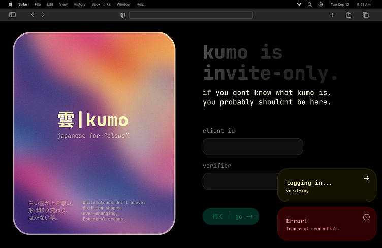
kumo is a simple design for, well, anything. The base concept was for something invite-only, which explains the lack of content explaining what kumo could be. The gradient was taken from this shot (thank you!).
This design features a shift from traditional user flows. Instead of "Sign Up" and "Log In" CTAs, kumo uses a blend of Japanese and English text to provide something new. Inspiration for input fields and labels has been taken from shadcn/ui to give it a sleek, Vercel dashboard-like feel.
The font used is JetBrains Mono, a monospace font that I personally really like. It sort-of motivates me to keep UI-related text short, and let the content do the talking.
The toasts are a custom invention. Sure, they could use a little more color balancing (making them stand out less), but that's up to you. I prefer to using toasts for things that are really important, so I need them to catch attention.
Thanks a lot for looking at this!
(P.S. this is my first shot. Yay! Also, I'm 16, so please tell me if you think some elements in this design could use some serious fixing-up.)
