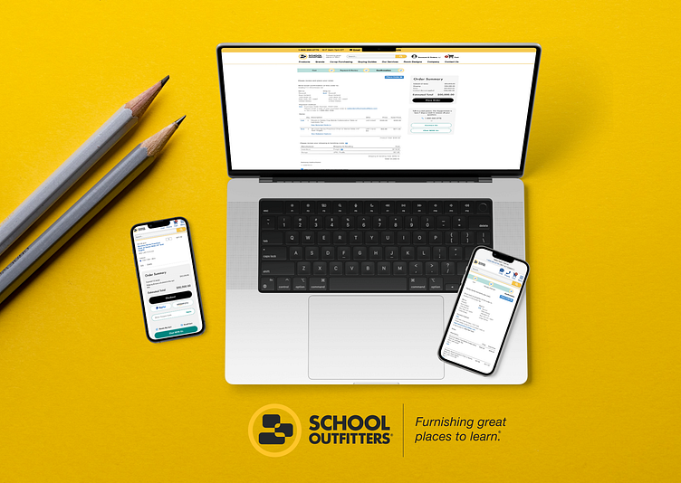
School Outfitters - Checkout Progress & CTA Designs
School Outfitters Checkout Redesign – Phase 1
For School Outfitters, I took on an exciting challenge to revamp the checkout experience for their e-commerce site, focusing on essential UI elements like a new progress bar, dynamic cart total section, and two engaging CTA modules.
Collaborating with an incredible team, including Amy, Tyler, and Chris, we took the project beyond its initial scope, fine-tuning the user journey and enhancing the designs provided by another agency to align perfectly with their brand goals.
This phase 1 project lays a strong foundation for the next steps in creating an intuitive, frictionless checkout flow that will make ordering school essentials even smoother. Big thanks to School Outfitters for the opportunity—I’m looking forward to what we’ll create next!
