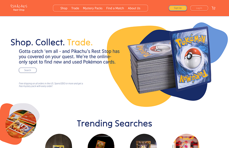
Pikachu's Rest Stop | Day 02
30 Days of Web Design Challenge | Day 02
For day two of this challenge, I designed a hero section for an online trading shop for Pokemon cards. For Pikachu's Rest Stop's brand identity, I leaned heavily into the Pokemon card color scheme and design, using similar primary colors of light slate blue, dark blue, mustard yellow, and bright orange-red. I chose a heading typeface that felt playful and inviting and had a fun gaming vibe. Rounded pillbox-shaped buttons and organic blob shapes compliment the typeface and the playful yet welcoming vibe of the brand.
To learn more about me and view more of my work, please visit my site at amandabarmash.com. Thanks for looking!
More by Amanda Barmash View profile
Like
