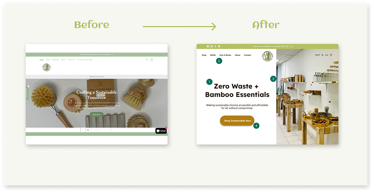
Before & After Hero Design
Exploration before & after - Omo Bamboo
I love supporting local businesses, so I was excited to discover this refillery nearby. They primarily specialize in bamboo products due to their sustainable qualities. Their mission is to provide customers with quality items at affordable prices while making zero-waste options accessible to everyone.
1️⃣ A bold yet calm display font, Lexend, was used, and the text was revised for better clarity about what the company sells.
2️⃣ The navigation bar was cleaned up, and new categories for "Refills" and "How It Works" were added.
3️⃣ An image of the actual store was included. Not only is it beautiful, but it also gives potential visitors a glimpse of the shop they might want to visit.
4️⃣ The “Shop” call-to-action button was changed to match the colours of the store for greater consistency and visual appeal


