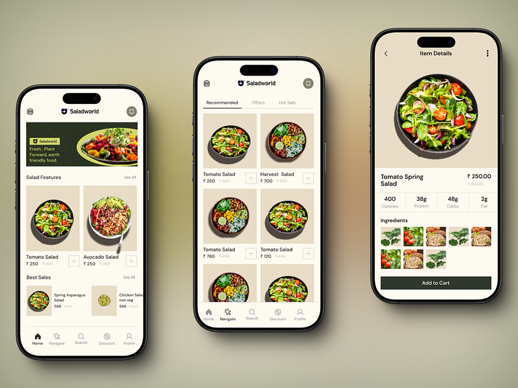
Salad App UI Design
Here is a recreation of the Saladapp with a little twist from my side.
Introducing SaladApp, where I created a seamless and inviting experience for healthy food enthusiasts!
🍃 Here’s a glimpse into my design process:
1️⃣ Minimalist Layout: The clean, user-friendly interface puts a spotlight on the fresh ingredients and vibrant salads. I kept the layout intuitive, allowing users to easily explore different salad options and make quick purchases.
2️⃣ Tab Navigation: Tabs like "Recommended," "Offers," and "Hot Sale" make it easy to switch between categories and find the best deals. This structure prioritizes user convenience, enhancing the shopping journey.
3️⃣ Visual Hierarchy: I designed high-quality product images to stand out and kept pricing prominent but not overpowering, guiding users' eyes through each screen effortlessly.
4️⃣ Nutrition Focus: In the item details page, I highlighted essential nutritional info like calories, protein, and carbs to appeal to health-conscious users and build product transparency.
Huge thanks to the design community and mentors at dribble for their support and inspiration!
Design Inspiration: https://dribbble.com/shots/21516239-Saladworks-Mobile-App
If you’re passionate about UI/UX and product design, let’s connect, or tag someone who might be interested in innovative UI design in food tech.
If you’re passionate about UI/UX and product design, let’s connect, or tag someone who might be interested in innovative UI design in food tech.
#UIDesign #UXDesign #ProductDesign #HealthyEating #FoodTech #DesignThinking #Dribbble #LinkedInDesign #SaladWorld #HealthyLifestyle #DesignInspiration @LinkedInDesigners @ProductDesignersWorldwide


