IMAGERY / Design Concept
Finally new design concept 🥹
👋Hey folks,
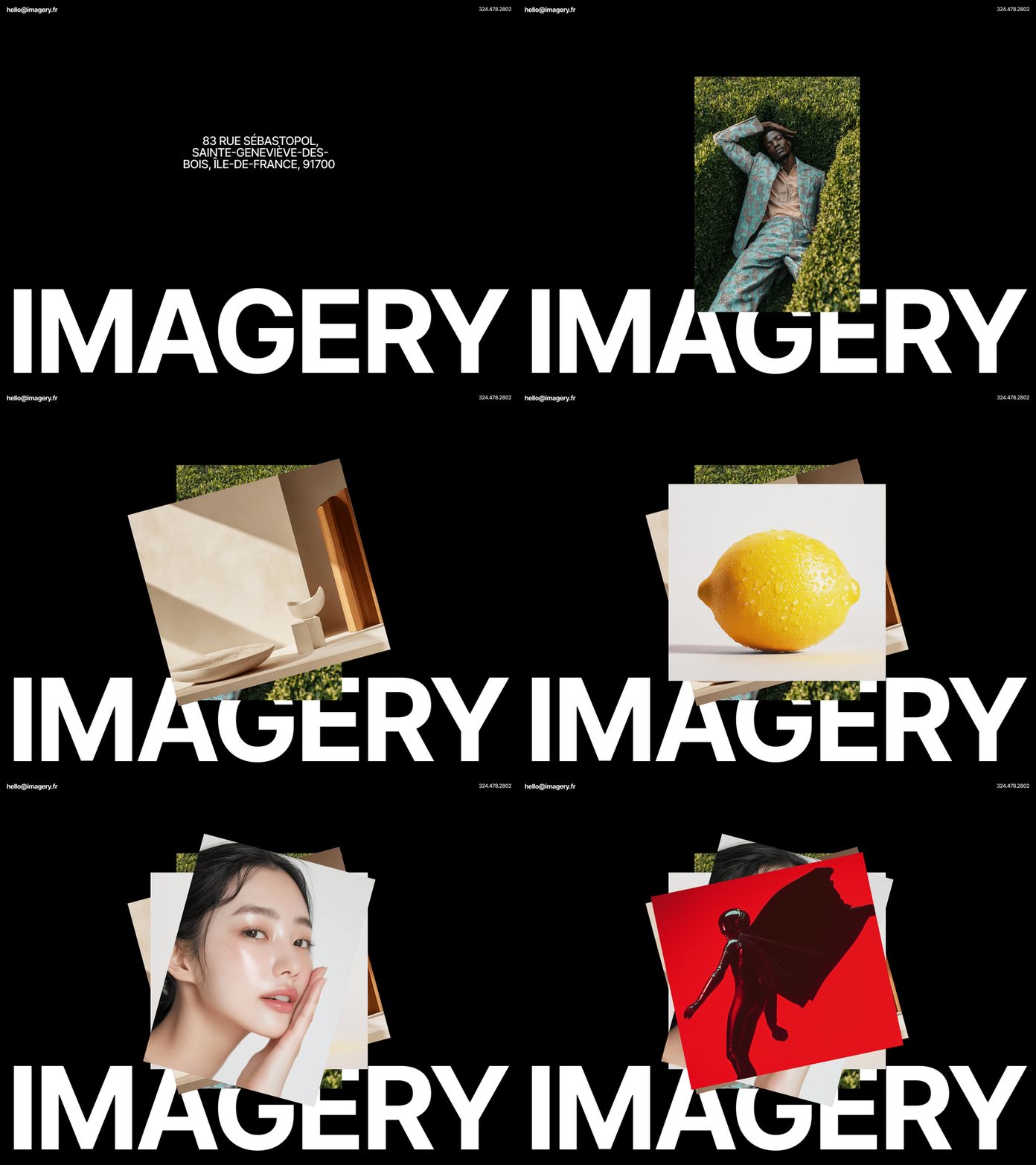
I come back to you with a fresh design concept for a photo agency "IMAGERY' . 📸
In these design concepts, I wanted to focus the main attention on the most basic elements - images 🖼️. Tried to make them as expressive as possible 🎉.
For almost every photo, I've added a short description 📝 (author , date, series) and an opportunity to learn more about that photo 🫣.
I tried to combine the text and photos into a composition that would be interesting, simple and clean 🫧.
In the first screen, I used an auto slider, which allows me to show many projects 💼.
In the projects section, I decided to make a clear and simple projects grid. Still, the main focus should be on the images, so they need to be made larger. But the larger the frame, the fewer images will fit on the screen. And in this case I have to choose the best option between the number of projects and size of their images 😮💨. I decided not to add the name and additional information about the project in order to create more space for images and make the design as clean as possible. To somehow fill the excessive free space, I decided to add a simple filter by categories and years 🗂️.


