REZ COFFEE & TEA | LOGO DESIGN & BRAND IDENTITY
The Rez Coffee & Tea brand carries the mission of creating a unique and interesting relaxing space, where customers can enjoy quality cups of coffee and tea. Rez is not just a coffee shop, but also a place to evoke a sense of nostalgia, creating connections through the characteristic image and the story behind the logo symbol.
The Rez brand identity designed by Bee Art uses two main color tones: dark green and beige. The combination of these two colors creates harmony, balance and brings a sense of nostalgia. Dark green represents strength, sustainability and commitment to quality, while evoking the image of natural tea leaves and coffee. Meanwhile, beige brings a gentle, warm and close feeling, helping to balance the overall logo. This color combination not only makes the brand stand out but also brings a friendly, approachable feeling, attracting lovers of the nostalgic style.
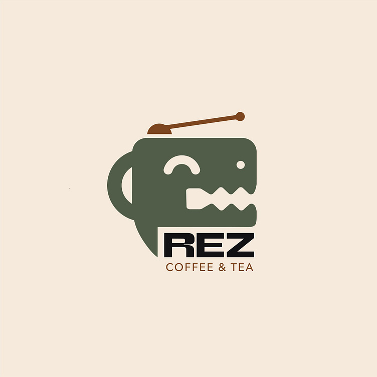
The Rez Coffee & Tea logo is creatively designed with the image of a coffee cup stylized into a lovely dinosaur, combined with a classic radio and a chat bubble. The dinosaur image has a strong meaning, evoking sustainability and uniqueness, while the radio represents a nostalgic element, evoking old memories. The chat bubble suggests connection and communication, encouraging customers to share their stories when they come to the shop. All these elements together create a logo that is both iconic and rich in connection, making the Rez brand unique and profound in the eyes of customers.
-
Client Rez Coffee & Tea
Logo Design Project. Logo is designed for Coffee shop.
Copyright© Bee Art. All Right Reserved
Contact us:
• Hotline/ Zalo: (+84) 77 34567 18
• Email: info@beeart.vn
• Website: www.beeart.vn
• Facebook: https://www.facebook.com/BeeArt.vn


