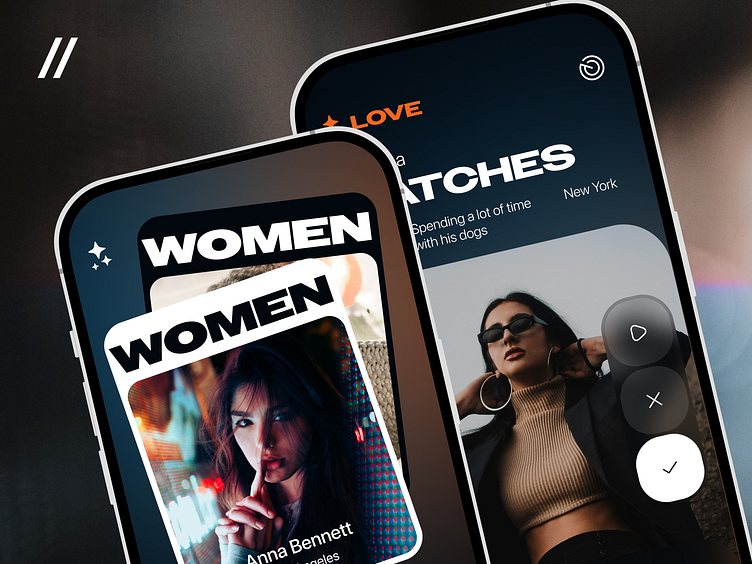
Dating Mobile iOS App Design Concept
Wanna know the project budget and timeline?
😉 Contact Us at purrweb.com
💜 WhatsApp - shoot a message
Hey there! Check out our Dating App design ❤️
👀 This app contains a questionnaire for users and a chat with an automatic translator that allows users from different countries to communicate successfully. Also, here, people need to record a self-introduction video 📺
The shot displays two mobile screens 👇
📔 the Cover screen with the service description
🏠 the Home screen that shows matches and a profile description
🎨 We created a dark 🕶️ color palette with blue and orange accents.
Blue 🌊 is associated with safety and professionalism, so, with this color, the service looks more trustworthy. Orange 🍊 adds dynamics and energy, which emphasize the innovative nature of the app.
The self-introduction videos represent the personal and non-trivial approach to dating. Users can present their personalities the way they like to and attract the other people’s attention. This helps to enhance their dating experience 🔥
The Owners typeface, taken from https://fonts.adobe.com/fonts/owners.
The SF Pro Display typeface, taken from https://developer.apple.com/fonts/.
The images by MohamadReza Khashay, Daniel Monteiro, and Philipe Cavalcante. Taken from Unsplash.
Press 💜 if you like our design and share feedback!
Check out our article if you’re interested in dating apps.


