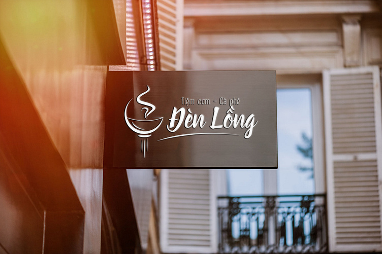
Đèn Lồng Restaurant Logo
Introduction
Hội An (Vietnam) is well-known for Vietnam Central traditional homemade cuisine. The logo is designed for a restaurant inspired by Hội An style. “Đèn Lồng” means “Lantern” in English, this design concept is the reflection of famous Hội An lantern and the shape of hot smoky bowl of food
Inspirations
The inspiration came from the images of famous Lanterns in Hội An & image of smoky, yummy bowl of food - also one of signature things of this land
Logo Options
Based on the request from my team, I had to show some logo options for my project. Because the name of this restaurant is “Đèn Lồng” (means Lantern), so that’s why I always choose the lantern image for all of 4 options
I just tried to change the shape of the lantern and bowl of food to make them so that they can harmonize overall. In the last option, I wanted to make a little difference when I put the abbreviation of name “ĐL” into the lantern, so that it can be a signature symbol. It doesn’t need to go with the name all the time.
Final Logo
After consideration time, the client decided to choose this logo option without changing anything
To demonstrate that the logo image can be suitable on traditional materials, in line with the image of Hoi An restaurant, I decided to demo the logo on some rustic products, paper materials to see the applicability of the design:
👉 Check out full designs & case study here: Restaurant Logo
👩💻 Here is my portfolio - looking forward to your connection: CanDy's Portfolio
Hope you like it and press "L" for appreciation 🥳


