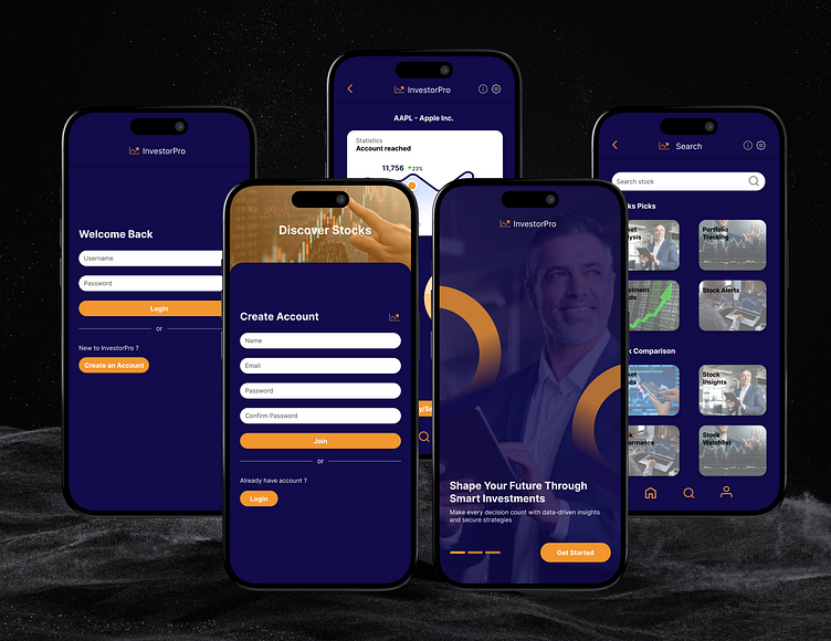
InvestorPro - An App
InvestorPro - An App
Investor Pro is designed to make investing easier and more accessible for everyone. With real-time data, smart insights, and easy-to-use tools, it empowers users to make confident decisions and grow their investments. From tracking portfolios to staying updated on market trends, Investor Pro provides a secure, all-in-one platform to help users achieve their financial goals.
My Role:
UX Research
Wireframing
Useability Testing
Hi-fidelity prototype
Problem Statement:
As an investor, navigating the complexities of the stock market can feel overwhelming. With scattered data, inconsistent updates, and a lack of tailored insights, making informed investment decisions becomes a challenge. How can investors find a reliable solution to track their portfolios, stay updated, and act quickly when opportunities arise?
Problem Solution:
Investor Pro offers a streamlined and accessible platform designed to simplify the investment process. With real-time updates and intuitive tools, the app provides investors with a straightforward way to monitor portfolios and stay informed about market movements. By consolidating essential data and personalized insights in one place, Investor Pro empowers users to navigate the market confidently and seize opportunities as they emerge.
User Persona:
In the ideation phase of Investor Pro, I created user personas as an essential part of my brainstorming process. By identifying and understanding my target audience, I could empathize with their specific needs, motivations, and challenges. This approach guided my design decisions, ensuring that each feature was tailored to address real user experiences.
Empathy Map:
To better understand the needs and challenges of Investor Pro users, I created an empathy map. This map allowed me to step into users’ shoes by exploring their thoughts, feelings, actions, and challenges. By identifying what users say, think, feel, and do, I could design features that truly address their pain points, motivations, and goals.
User Flow:
The user flow in Investor Pro guides users smoothly from onboarding through portfolio tracking, real-time market updates, and investment management, ensuring an intuitive and efficient experience.
Low-fidelity Wireframes:
Typography:
For Investor Pro, I selected typography that balances readability with a modern, professional feel, aligning with the app’s focus on clear information and data-driven insights. The Inter font, known for its clean lines and legibility, was chosen to keep data-heavy screens easy to scan. Font sizes were strategically set to 20px for primary headings, 15px for subheadings, and 13px for body text, creating a clear hierarchy. Colors #F2972F and #120B4C were used to differentiate text elements, enhancing readability and navigation across all sections of the app.
High-Fidelity Mockups & Prototypes:
Following the low-fidelity phase, I created high-fidelity mockups for Investor Pro to bring the app’s visual style and branding to life. These mockups incorporated the finalized typography, color scheme, and layout, showcasing a polished, user-centered design. I then developed interactive prototypes, allowing for realistic navigation and testing of core user flows, which provided invaluable insights and ensured a seamless, intuitive experience. This high-fidelity phase was crucial in refining design details before moving forward with development.
Conclusion:
In developing Investor Pro, the design process emphasized a user-centered approach, focusing on the needs and challenges of investors. By creating detailed user personas, structured user flows, and iterative prototypes, I ensured that the app not only provides real-time market data but also simplifies investment management. The final high-fidelity mockups reflect a modern aesthetic and clear typography, enhancing usability and accessibility.


