Error message
Error message
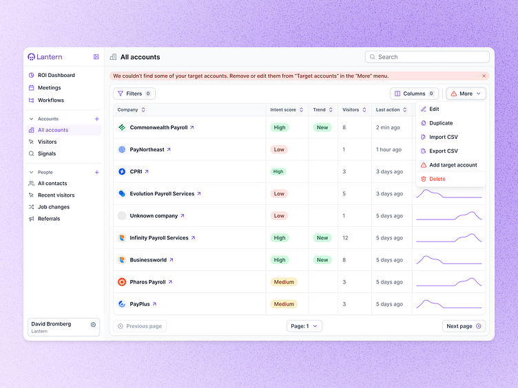
Here’s a snapshot of an error state UI I designed for Lantern's “All Accounts” dashboard, helping users manage their target accounts. The interface clearly alerts the user that some target accounts are missing, providing an easy path to remove or edit them via the “More” menu.
When some target accounts can't be found, the interface provides a clear notification banner, guiding users on what to do next.
🔍 Error Messaging Highlights:
- The warning banner appears prominently at the top, informing users that some target accounts are missing and offering clear instructions to resolve the issue.
- A warning icon appears next to the "More" button to intuitively guide users toward the solution.
- In the dropdown, the icon replaces the "Target Accounts" icon, reinforcing where users need to click to edit or remove accounts.
The idea is to make Error messages more intuitive on how to fix them as who wants errors just floating around their UI? :P
