Nanovis
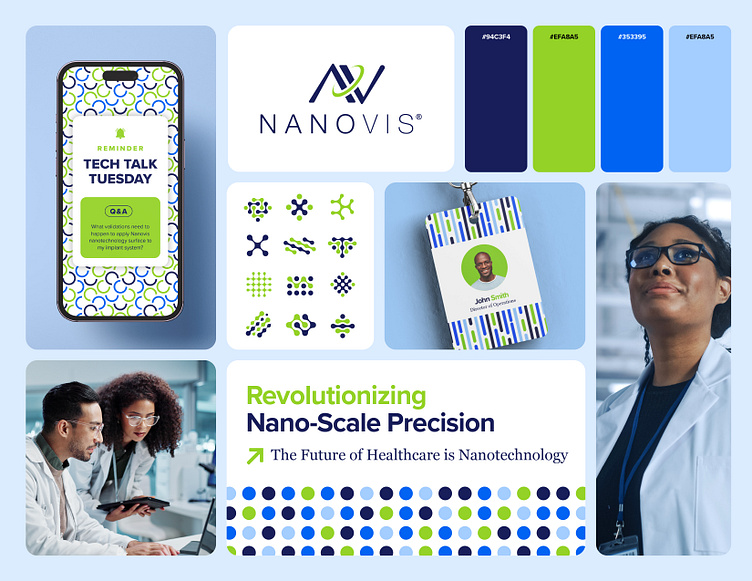
Our client, Nanovis, a nanotechnology company, wanted to elevate their brand to the next level. With nearly two years of collaboration behind us and a deep understanding of their business goals, I set out to refine their visual identity without straying far from their established branding. I crafted a more streamlined and practical color palette that retained their signature green and blue theme but addressed a frequent design challenge: poor contrast between the colors, especially the legibility of their green on white backgrounds. To resolve this, I introduced a deep navy and a vibrant royal blue—ideal for their digital-focused marketing—and modernized their green for enhanced readability on white.
In addition, working with low-resolution images had previously limited design flexibility, so I developed a series of custom brand patterns inspired by the shapes of nanotubes. These patterns will be adaptable across various platforms, giving Nanovis a cohesive, elevated look in every application.
