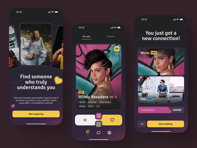
MBTI-centric dating app UI design
Back with another noise gradient design. To be honest I'm getting too comfortable in using this kind of style lol (good thing a new font is used here).
So the idea here is to create a dating app UI (and a little bit of context) with unique prepositions. If your usual dating app uses common interest to hook the other person, this app adds a layer right before that, which is an MBTI compatibility logic.
Why? Because there's a chart for that.
It turns out that a specific personality resonates more with other specific personality instead of randomly trying to see whether two or more persons are compatible. It's not accurate, but to some extent it is true.
So here it is, Hookd (a name I give spontaneously) for this fake project concept. Cheers!
More by AL SARDINI View profile
Services by AL SARDINI
Like


