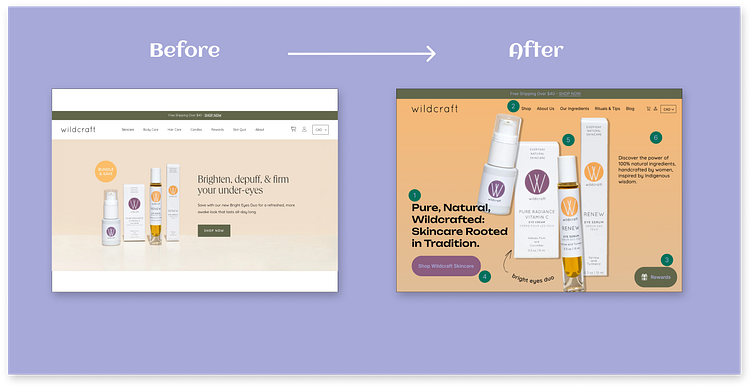
Before & After Hero Design
Exploration before & after - Wildcraft
While shopping at my local health store, I came across this brand and fell in love with its products—specifically the Vitamin C serum and Retinol cream. They tick off all the boxes for me: women-led, Indigenous-owned, eco-friendly & cruelty-free. I love the simplicity of their packaging and the colours are bright and cheerful. This copy emphasizes Wildcraft’s natural, handcrafted products and the deep connection to Indigenous heritage, appealing to customers seeking authenticity and quality.
1️⃣ A bolder display text is used, Unbounded Google font is a modern and unique display typeface that features bold, curved letterforms with smooth, rounded edges, giving it a friendly and approachable look.
2️⃣ Cleaned up the navigation bar for all products under the shop category - (would have a drop-down menu)
3️⃣ Removed rewards from navigation as it is being duplicated already with a floating cta button
4️⃣ Changed the “shop: cta button to match the colour of the packaging for more consistency and less competition with the rewards cta
5️⃣ Made the product images larger for more emphasis and tilted them for a more playful design
6️⃣ Made the background brighter by colour-picking the product and using gradients to give more depth


