PPT Presentation Design
PPT Presentation Design for Training Foundation - Firefighters of Chile
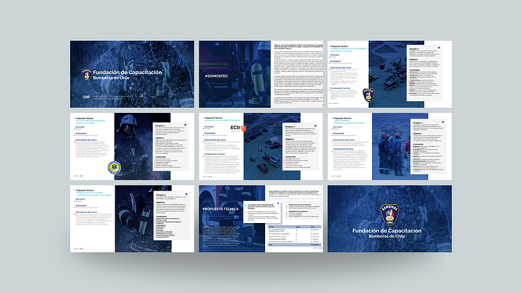
This presentation is designed as a technical proposal aimed at the brigades of Firefighters of Chile, highlighting the updated procedures for 2023. The goal is to communicate clearly and professionally, reinforcing the foundation’s commitment and seriousness with a sober colour scheme and a well-organised visual structure.
Key Design Elements
Professional and Sober Visual Style:
A dark blue background is used as the base for all slides. This tone conveys seriousness, professionalism, and commitment, qualities essential in firefighter training.
The presentation aims to convey formality and clarity in each section, with simple and effective graphic elements that do not distract from the crucial information.
Organised and Clear Layout:
A clean visual structure is prioritised, with easy-to-read slides that follow a logical order of technical content. Titles and subtitles are prominently displayed, making it easy to navigate and quickly understand the topics. An agenda slide at the beginning details the training content, and a slide with objectives provides context to the audience.
Typography and Visual Hierarchy:
Sans-serif fonts like Arial or Calibri are used in white or light grey tones for adequate contrast with the dark blue background. The visual hierarchy ensures that titles and key messages stand out, while supporting text is kept at a moderate size to avoid visual clutter. Important sections are highlighted with subtle boxes or underlines.
Specific Graphics and Iconography:
Simple and minimalist icons related to safety, procedures, and firefighting equipment help visualise technical topics without overloading the design. Bar charts and flow diagrams are used to represent procedures and statistics clearly, maintaining a technical yet accessible presentation.
Representative Visual Elements:
Photographs of firefighters in training or in action, as well as specialised equipment, are placed strategically to reinforce the connection with the target audience.
These images are kept in neutral tones or with filters that harmonise with the dark blue background for visual cohesion.
