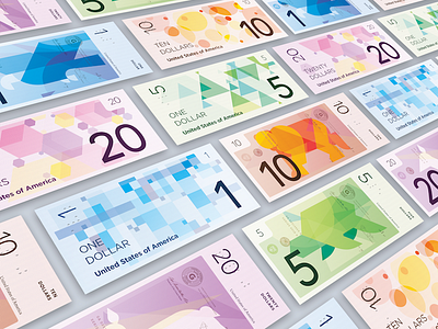
American Currency Redesign
Angled shot, drop shadow, lots of colors. Dribbble worthy?
This was in coordination with a school project where we had to redesign the American paper currency. Attached are some shots for my presentation and my submission.
The design of these dollar notes are distinctly colorful to help with differentiation. For those who are colorblind, the number of the note stands starkly against the rest of the bill. Also, for those who are completely blind, the bills have a tactile braille number system on each number.
I also wanted to stay away from the old illustrations of old representations of America. Not only that, but I chose to utilize illustrations of strictly animals that do not have any associative bias. Except the bear. I think Leonardo DiCaprio has an issue with bears now.
It's time we become more inclusive and think of the scenarios that some of us can't experience to the fullest extent.


