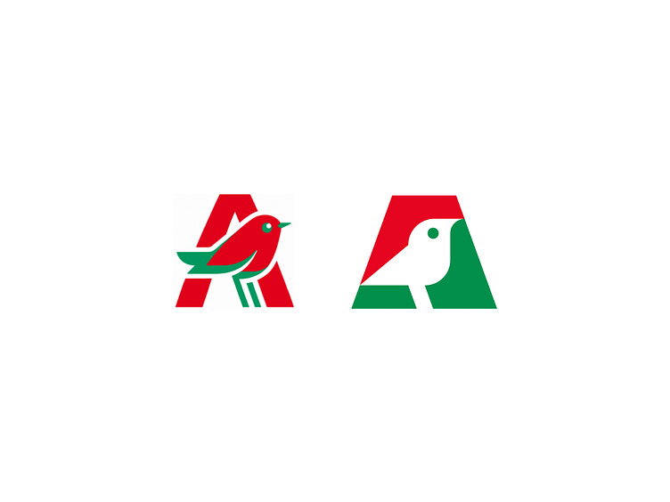
Auchan Logo Redesign: Negative Space Bird Icon in Letter A
This redesign of the Auchan logo presents a modern, refined look by incorporating a bird icon within the negative space of the letter A. The bird, a nod to freedom and exploration, reflects Auchan’s commitment to accessibility, quality, and innovation for its customers. The minimalist style streamlines the original logo, enhancing brand recognition while adding a fresh and sophisticated aesthetic. This updated design speaks to Auchan’s enduring values and its mission to soar above in providing excellent service and products.
More by Logotypely Team View profile
Services by Logotypely
Like


