CREEPY, CRAWLY & CUTE
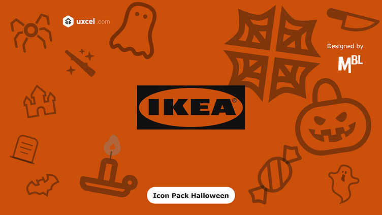
This project is about creating a set of Halloween-themed icons for the IKEA app. The goal is to design special icons that capture the spirit of Halloween, but at the same time maintain IKEA's minimalist and functional identity. These icons will be used temporarily during the Halloween season to improve the user experience and add a festive touch to the platform.
For the sketches, I started by creating simple, basic shapes representing pumpkins, witch hats, and skeletons, using fine lines and geometric figures. In the first versions, I played with more detailed shapes, but reduced the details so that the icons looked cleaner and aligned with the IKEA visual style. Finally, I decided on simplified versions that integrate easily into the interface without being cluttered.
The icons were designed to be clearly visible on different sizes and screens, from mobile phones to the desktop web version. I reduced the details of the icons to ensure they maintained their shape and meaning even at smaller sizes. This is key to maintaining functionality, something that is essential in IKEA's minimalist approach.
Development of the idea:
The central concept was to mix classic Halloween elements (like pumpkins, ghosts, bats, and witches) with the simple and functional style of IKEA. The inspiration came from minimalist Halloween decorative objects, creating a reduced version of the typical symbols so that they were visually harmonious with the app's interface. The icons align with functional tasks, such as navigation, shopping cart, categories, and user profile, but with a festive touch.
I chose a minimalist style, predominating clean lines and a flat approach, but incorporated some iconic Halloween elements. The figures have a playful design but without losing clarity. This ensures that users can quickly associate the icons with Halloween without confusing their functionality within the app.
I used a classic Halloween color palette: black, orange, purple and white. Black was used to create a high contrast with the white background of the app, and orange and purple added that festive and vibrant touch. These colors were selected to be clearly visible in both light and dark modes, and to ensure that users can identify the icons without difficulty.
The central concept was to mix classic Halloween elements (like pumpkins, ghosts, bats, and witches) with the simple and functional style of IKEA. The inspiration came from minimalist Halloween decorative objects, creating a reduced version of the typical symbols so that they were visually harmonious with the app's interface. The icons align with functional tasks, such as navigation, shopping cart, categories, and user profile, but with a festive touch.
Discuss the color palette:
The color palette was adapted to ensure that the icons are easy to identify no matter how the app is displayed. The main colors, black, white and orange, were selected for their relationship with Halloween and their ability to stand out in the interface, without losing the minimalist touch.
I chose a minimalist style, predominating clean lines and a flat approach, but incorporated some iconic Halloween elements. The figures have a playful design but without losing clarity. This ensures that users can quickly associate the icons with Halloween without confusing their functionality within the app.
Present designs or interactive prototypes:
The final solution includes a set of themed icons that integrate perfectly into the IKEA app for the Halloween season. These icons maintain visual coherence with the brand, but add a festive atmosphere. Users can interact with the icons and experience them in different screen resolutions and modes.
The interactive prototype shows how these icons can be used in the app to guide users through the shopping experience, improving interaction while adding a touch of fun to the IKEA platform during the Halloween season.
Conclusion
The conclusion of the "CREEPY, CRAWLY & CUTE" project highlights the successful integration of Halloween visual elements into IKEA's minimalist identity, achieving a perfect balance between simplicity and festive theme. This redesign uses Halloween icons and humorous touches, attracting and creating a playful atmosphere without losing the brand’s functional and clean essence.
The use of iconic Halloween symbols, such as pumpkins, bats, and spider webs, not only enriches the user experience but also incentivizes purchases by making the app feel festive and relevant to the season. This thematic ambiance provides customers with an immersive experience that enhances interest in buying specific Halloween products or seasonal preparations, allowing the app and its shopping interface to connect emotionally with the user and encourage active participation in the celebration.
In summary, this approach maintains IKEA's intuitive and accessible design, adding a festive touch that invites users to explore and enjoy the season, making the shopping experience a fun and memorable part of Halloween celebrations.


