Website for the Brand That Offers an Online Massage Course
This Course Will Help You Relax 💆🏻♀️
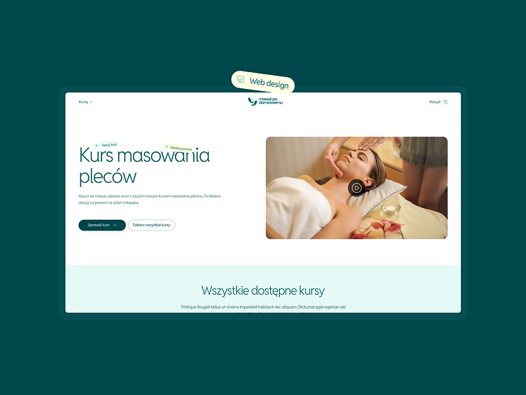
The website for polish brand Masaż po Domowemu is a perfect example of thoughtful, user-centered design that reflects the brand’s core values.
Simplicity, relaxation, and visual accessibility make it easy for users to understand the offer and quickly decide to purchase the course 🛍️
The site was created in line with modern design principles, harmoniously combining aesthetics with functionality.
Calming Atmosphere of the Website
The design features soft pastel shades of mint and white, bringing a sense of freshness and tranquility. This color palette creates a relaxing atmosphere, perfectly aligning with the theme of massage.
Green buttons and subtle tags are used as accent colors to highlight key elements and enhance usability.
The typography is elegant and minimalist, featuring clean, rounded fonts. The lightweight and spacious lettering improves readability and gives the website a friendly, approachable character ✨
What Else Makes the Website Stand Out? 👨🏻💻
The site’s structure is clear and intuitive. Content is well-organized, enabling users to easily find the information they’re looking for.
Images on the site showcase scenes related to massage, emphasizing the comfort of a home setting. These warm, professional photos build trust and authenticity, making the offering feel both approachable and credible.
This blend of relaxation, simplicity, and modern design makes Masaż po Domowemu’s website an inviting and efficient platform for users to explore and embrace online massage courses!


